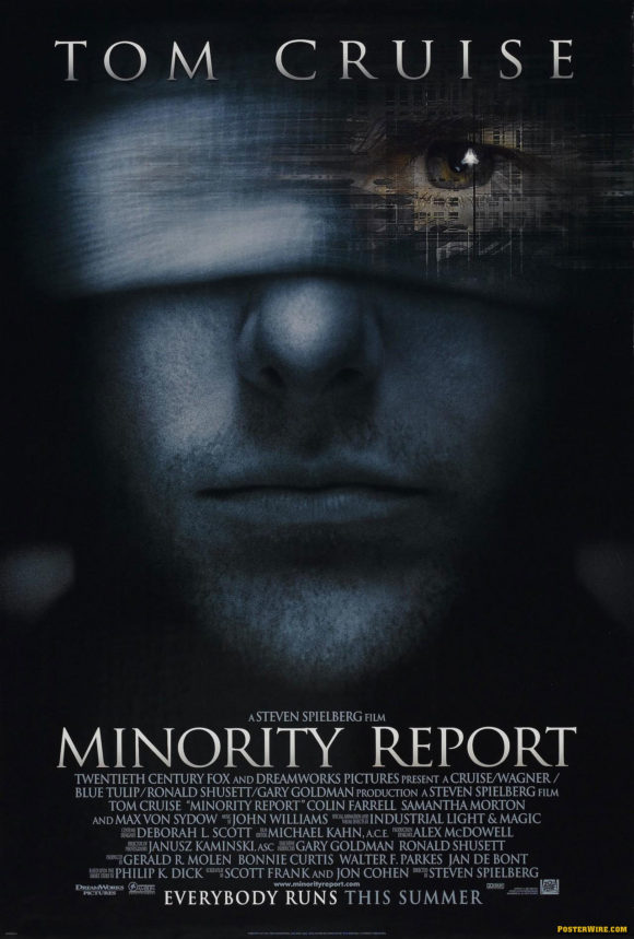
Most Popular Movie Poster Title Typeface: Trajan
There’s a common saying among movie poster designers and art directors when designing film title logos:
“When in doubt, use Trajan.”
Why such a mantra about using a font? According to an anonymous creative director:
“Clients love it. They love it’s elegant look and always gravitate towards it or similar style typefaces.”

A short film about the (over)use of Trajan: “Trajan is the Movie Font”
Another film about Trajan in movie posters: “Etched in Stone”
Trajan was created by font designer Carol Twombly in 1989. As mentioned in the Veer “Etched in Stone” short film, the type is based on the classic etched style of ancient Roman era serif lettering. As a display typeface, it’s influence is wide reaching in the world of movie poster logotypes — even film logos that aren’t technically using Trajan are using similar looking typefaces derived from the Trajan lineage.
Speaking of type, if you need help in identifying the likes of Trajan (or any other typefaces used in movie posters and elsewhere), look no further than the Type Identification forum over at the great site Typophile.com. You can also try IDing a font by uploading an image sample to WhatTheFont.

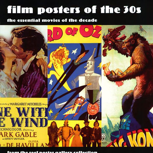
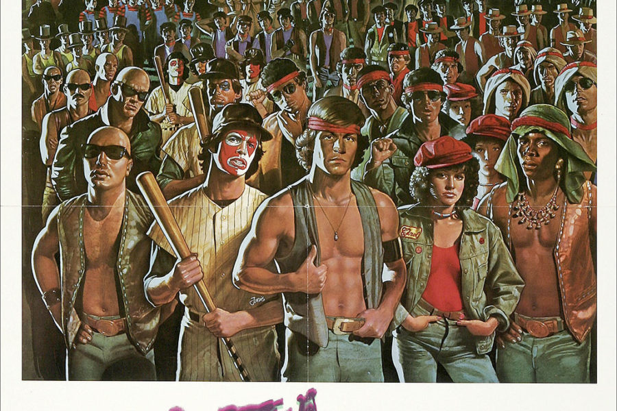
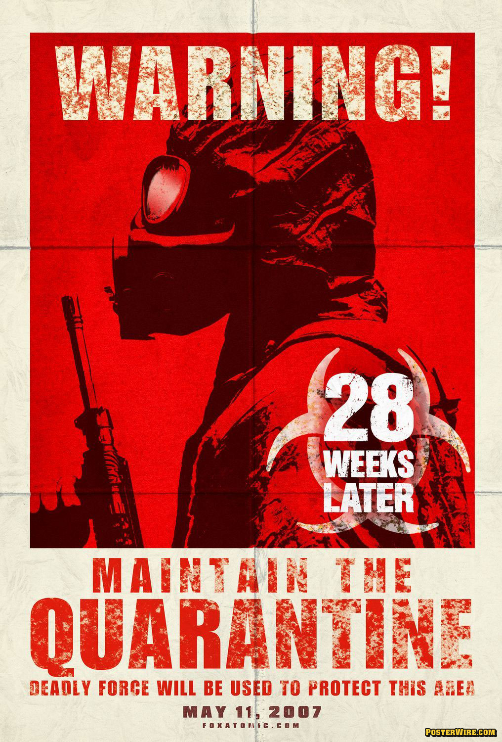
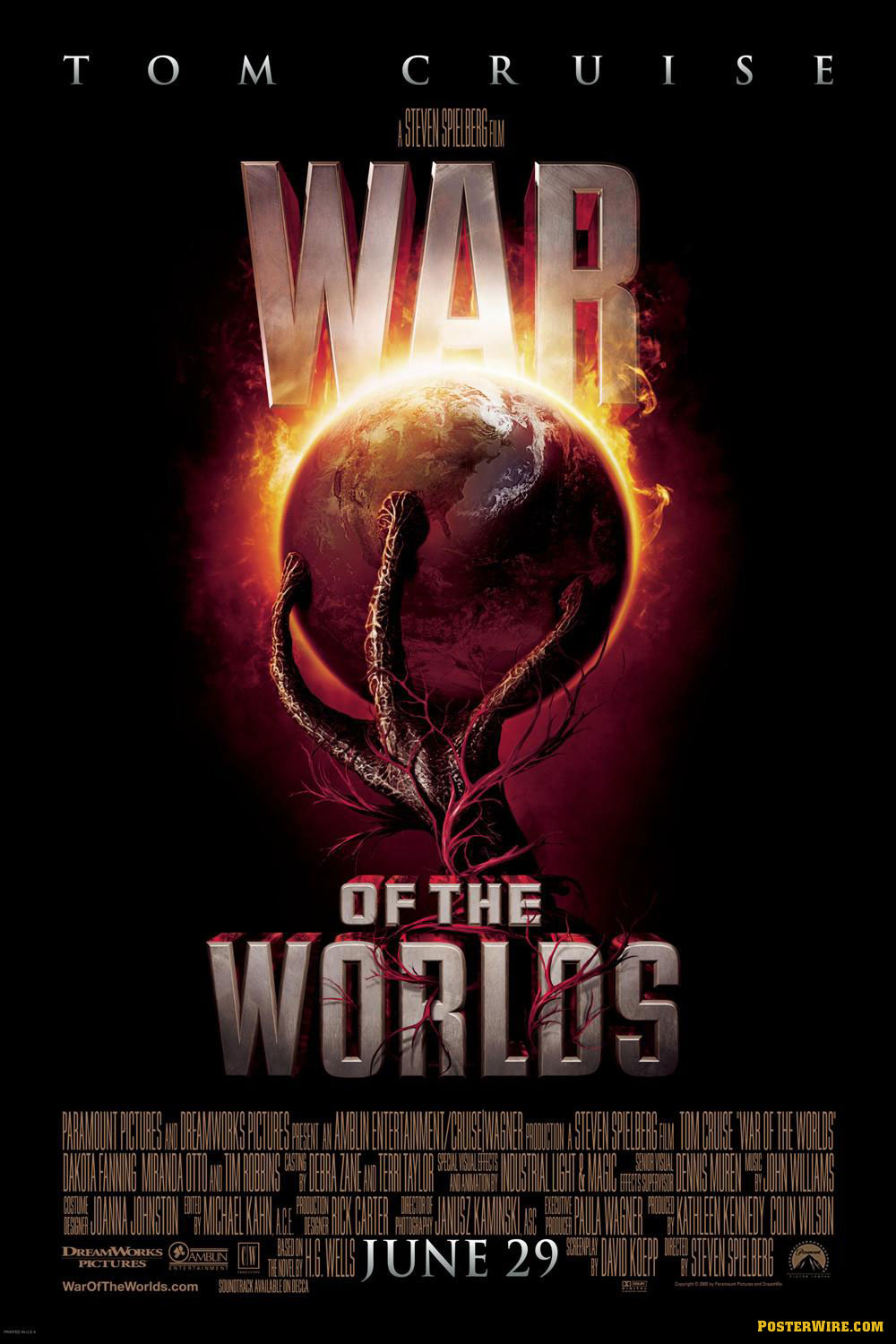
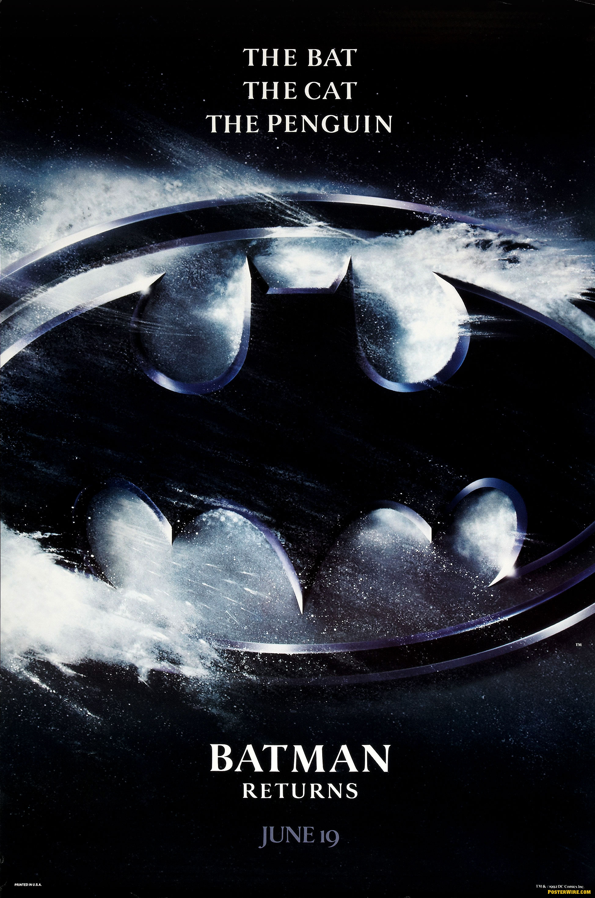
Cheshire tells me the GLADIATOR logo isn’t using Trajan. (I guess it will count as one of the many “similar” faces used.) My disdain for IDing or writing intelligently about typography is well known. :( Anyone care to comment further on the face being used?
I believe that the Gladiator logo is based on Monotype’s Castellar face. Castellar is an engraved or inline design and those details have been removed. The finer details in the serifs and stroke connections have also been obscured by the texture applied over the logo. Here’s a visual comparison for reference:
http://www.flickr.com/photos/splorp/26852439/
Indeed Gladiator is not Trajan — but it’s quite similar. As much as I do think Trajan is beautiful, it’s quickly becoming so overdone as to be annoying. I’d suggest avoiding it whenever possible, just because of that.
Thanks for the info complete with “show your work” images — always appreciated.
Maybe we should have called The Cimarron Group and asked what typeface they used in the Gladiator poster. I’m glad I included those two “type ID” links in this post because clearly they are needed to cover the mistakes on this weblog when writing about typography. ;)
yes, neither of the fonts used in the 2 examples this article are Trajan!! yikes
Yes, I believe this is covered in the comments section. ;)
Fer chrissake, they’ve even used a variant of this font on “The Texas Chainsaw Massacre”! Follow the herd…