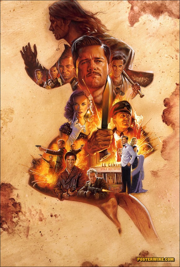
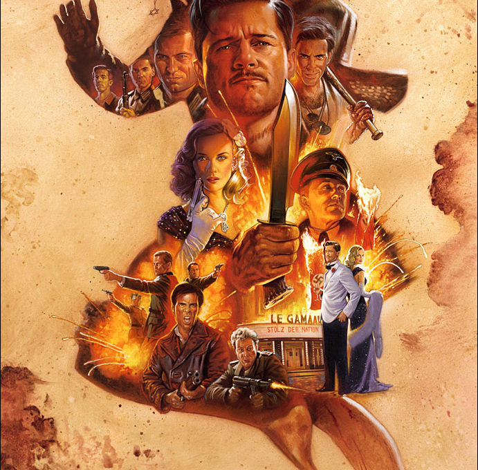
Unused Inglourious Basterds movie poster art
Illustrator James Goodridge shares a completed (and unused) illustration he created for a proposed Inglourious Basterds movie poster. As one of the few traditional illustrators working in Hollywood, James was also kind enough to answer a few questions about his background, his illustration work in entertainment advertising, and how he came to work on Quentin Tarantino’s Inglourious Basterds:
Could you provide a short bio, including your education and work background, and how you came to Hollywood via London?
My formal education is sadly zero. The UK in the early 80’s was no place to get an art education. Without getting into political history, for reasons beyond my control the privilege of a college education was not an option. To this day it is something I wish I had been able to experience. I think part of the point of college is to give people the opportunity to be self indulgent, broaden one’s horizons, make mistakes and develop one’s own voice. I recall one college tutor at my interview saying “It looks like you know what you want to do, you’ll be fine.” The implication was that the place would go to a more “needy” candidate given the limited number of spaces. Amazing attitude from someone who should have known better.
Instead at the age of 18 I created a portfolio of would be movie poster illustrations over the summer and got a job with FEREF, a movie poster studio in London for the princely sum of 4000 pounds a year. I was fortunate enough to be surrounded by the work of pre-eminent illustrators Brian Bysouth and Mike Bell. This was the closest thing I got to an education. A year later they were in financial difficulty, it must have been the 4000!
All this is before the internet so if you wanted people to see your work you couldn’t email it or create a website for it so I carried my huge portfolio to and around Los Angeles where I was well received and encouraged. Returning to the UK I subsequently worked for several years primarily illustrating book covers but returned to work in Los Angeles in the early 90s and met Drew Struzan whose work I had admired since childhood seeing his Alice Cooper album covers. I also was fortunate enough to meet and get to know John Alvin and it became clear that illustrators were still in demand, as John described it, “We’re now Hollywood’s best kept secret.” It was still some time before the studios were willing to “take the risk” of trying someone new but it is a very small community and once one studio uses you, people are very generous in recommending you to other studios.
Some of your work in Hollywood is as a film key art illustrator. One aspect of this is you do illustrations for movie poster concepts, photo shoot ideas, and other advertising proposals that the general public doesn’t see. In other words, many film advertising projects have illustrations generated in early stages even if the final product is photo based. Can you explain more about this type of work?
Primarily my job is to sketch the ideas of art-directors. Usually this means getting a thumbnail and a little reference for mood, sometimes it’s just a sentence and it’s up to me to compose it and bring it to life. Some clients are happy for me not just to communicate their ideas but to conceptualize myself: Wall-E, King Kong, Defiance and Hidalgo are examples of this. But mostly it’s a question of just making their ideas work. These concepts are presented to the client and photoshoots are arranged and that’s the end of my involvement. Although finished illustration is seldom used for a poster the work of the illustrator is still very much respected and I have been fortunate to work with people who, when the rare opportunity arises, will push for an illustration. It just doesn’t always work out. Equally there are times when a full colour comp or series of comps are commissioned even when there is no way an illustration would even be considered for the finished poster (Spiderman, Charlie’s Angels) but it communicates to the executives even more clearly than a black and white pencil sketch. Then there are the unexpected occasions such as with the Dogma DVD when, despite the prevalence on DVDs of new photographic covers being produced, I was asked to illustrate a cover but overall yes, photoshop dominates. Naturally I wish it wasn’t so dominant and there are many projects where I think illustration would have been a better option. Equally there are many projects where I think photography and photoshop are the right medium. When a photograph is interpreted by an illustrator inevitably there are choices made in terms of colour and emphasis which the use of a “cold” photograph does not permit. If you look at the meticulous scrap which [Norman] Rockwell shot and then look at what it became when translated to a painting you’ll get my point. The “danger” of photoshop is when rather than expanding your options it restricts them and the concept is dictated by the medium rather than the concept dictating the medium.
An illustrated movie poster is now the rare exception, rather than the norm. As one of the few key art illustrators working in Hollywood, how do you feel about this shift and the lack of illustrated movie posters when compared to the past?
There are those who maybe consider illustration old fashioned or dated. But there is seldom anything inherently dated in the work itself it is simply that it has been out of the public’s consciousness for a number of years. In fact it is often art that attempts to keep pace with fashion which is more likely to date, and faster given the transient nature of fashion.
Can you tell us how you came to work on Inglorious Basterds? The film’s marketing campaign used conventional photo based posters for all it’s one-sheets. Why did you decide to finish the proposed artwork you created as a final illustration on your own even if the studio had passed on it?
In the case of Inglourious Basterds I was called by the much respected creative director I’ve worked with on numerous projects including the Harry Potter series, 300, Lust Caution. The movie studio had already produced some teaser posters but wanted a fresh take, truer to the director’s vision and influences and the story. The creative director had only a few requests from the studio but this was to be an occasion where I had considerable creative input. I came up with 6 designs one of which became the favourite of all concerned. However at this time the movie studio decided they’d like to try building it in photoshop. A few weeks later I was asked to produce an illustrated comp. I should mention how important it is to have a creative director who believes in the illustration option and I was so fortunate that this was the case. The comp was approved with only minor changes but we heard nothing more. I never met with anyone at the studio or the filmmakers so I don’t know what took place but the decision was made not to pursue the illustration. I elected to paint a finished illustration as I didn’t want to get a call at the eleventh hour and have to produce it under the gun. So even when the illustration option is supported by the creative director and the filmmaker himself (check out the lovingly recreated posters used on the set of Inglourious Basterds) it is not a “slam-dunk”. It’s important to say that this is not unusual, people change their minds. Even an illustrated poster for Indy 4 was not a foregone conclusion. Now to people who care about these things it’s like not having John Williams score the movie or casting Matthew MacConnaughy as Indiana Jones but in the end fortunately the right choice was made.
Bottom line: This was the one project this year I thought I’d never get the opportunity to work on after seeing the early teasers so I was really excited to work on it. Yes, I wish the image had been used but I’ve been working in this arena long enough to know that, until it’s printed, nothing is certain.
You can see more of James Goodridge’s illustration portfolio by visiting his website James Goodridge Illustration.

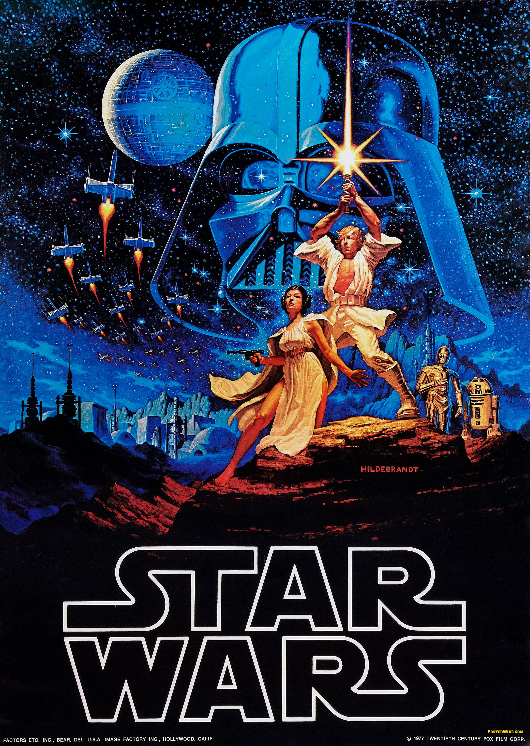
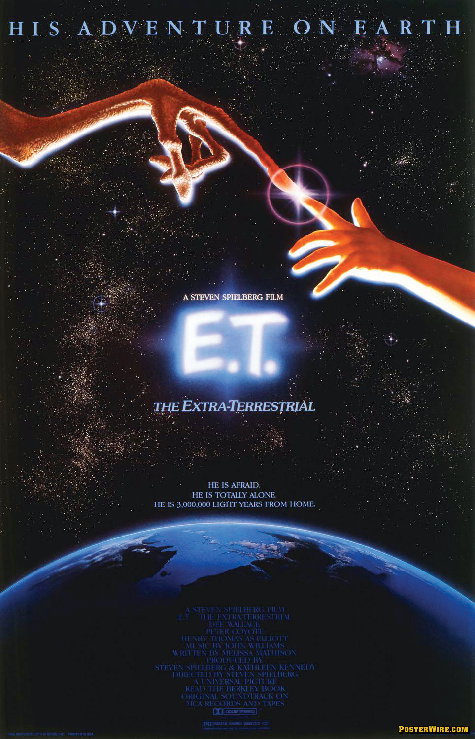
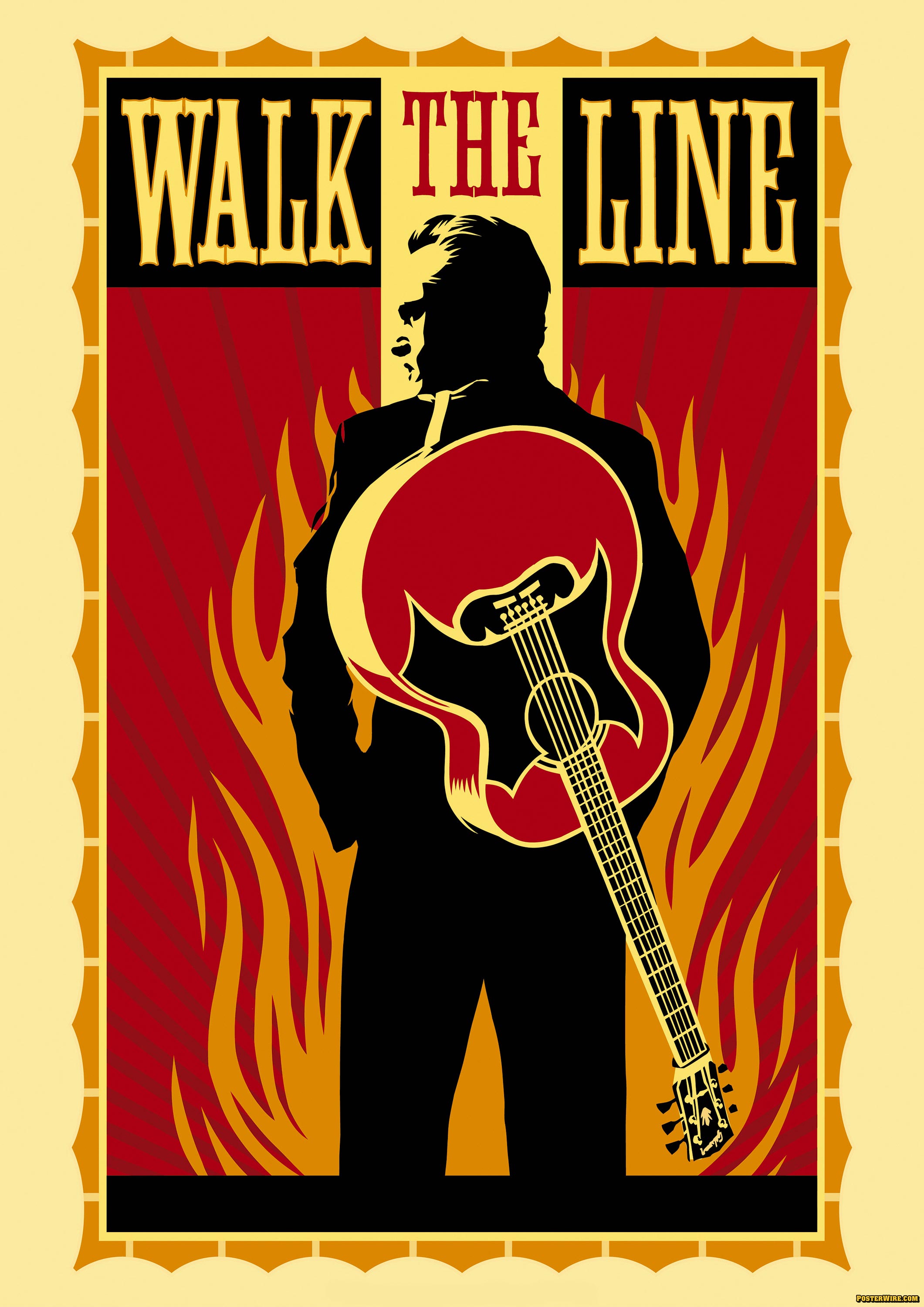
Posterwire lives! Illustration lives! Great article.
Nice interview.
That’s some pretty good insight from James. It must be tough to spend what must be days on the poster only to have it unused. Does he still get paid? And is it the norm to get a call at the 11th hour and be expected to turn out the full poster the next day? I think Illustrators generally aren’t given the respect they deserve and that’s why it’s always refreshing to find someone who DOES, as James mentions in the article.
It’s cool to see the “designers cut” so to speak. Thanks for posting!
I think it sells it perfectly actually.
The red background of the artist’s own website is, um, a bit bright. But this guy is obviously extremely talented. They should use his great Basterds art for the DVD cover.
(By the way, nice to see a new article at Posterwire.)
I love it! I’d buy one if you’re selling it.
I’d buy this version of the poster in a second- I certainly wish I could order a special printing!
incredible looking poster!
you should definitely do a limited run of screenprints or giclees or something!
Great News. You can buy a print of this Unused Inglourious Basterds movie poster by James Goodridge exclusively here:
Buy Inglourious Basterds movie poster illustration
So Starwars’ish, still a classic.
Amazing poster, i’m thinking about buying it.