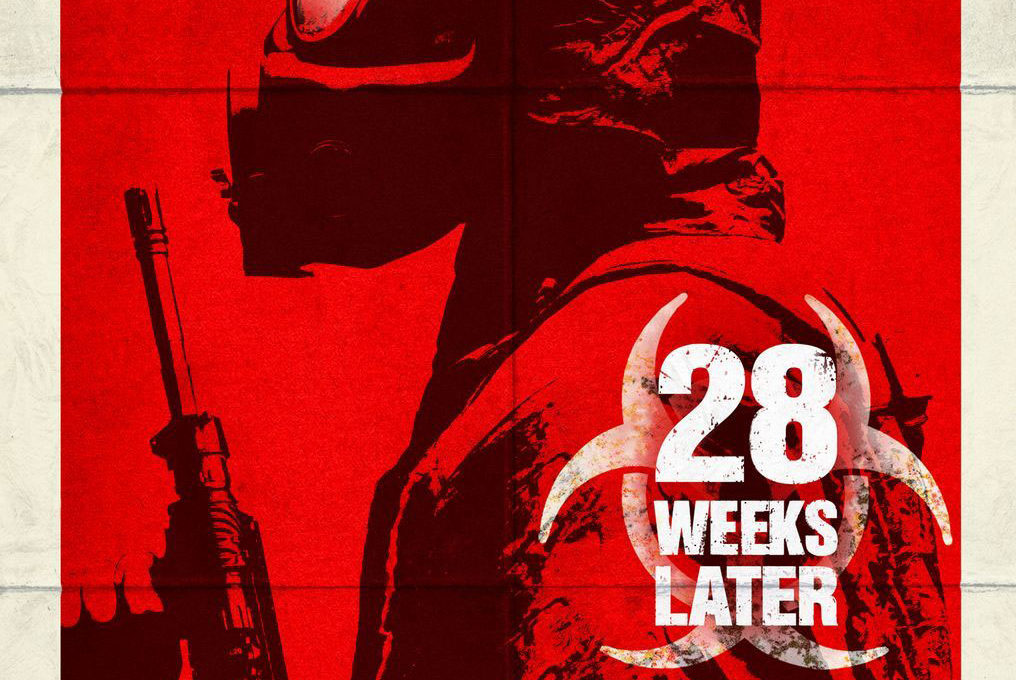

28 Weeks Later movie poster
Entertainment Weekly has a first look at the movie poster for 28 Weeks Later, the sequel to the horror film 28 Days Later. The article is a bit underwhelming, but it does have an interesting quote by Fox Atomic senior VP of print advertising Karen Crawford. Discussing the “concession” of re-using the biohazard title treatment logo from the previous 28 Days Later poster:
I’d like it to not have that logo. But, of course, this is a movie we’re advertising.
We can easily imagine a cynical tone in her voice when saying that.
The why-oh-why-must-we-be-shackled-by-this-logo-from-the-past anecdote reminds us of a light bulb joke about designers:
Q: How many graphic designers does it take to change a light bulb?
A: Does it have to be a light bulb?
If you chuckled at that joke then you probably work in a creative field. This light bulb joke also happens to be the ONLY joke about graphic design that we know of. Niche jokes aside, the Fox exec quote seems to explain why the 28 Weeks Later poster tries to hide the biohazard symbol by fading the edges of the symbol behind the logotype. This is an unfortunate choice since the faded red of the logo clashes with the duotone street art style of the rest of the poster’s key art. It also doesn’t help that fading the color red can sometimes read as pink in color. It looks like the biohazard logo fell victim to death by half-hearted inclusion, which many designers are familiar with.
Hmmm…I read that quote as saying she’d prefer the poster not to have a movie logo title at all (i.e., to look more like a quarantine poster than a movie poster), rather than not to be re-using the logo scheme from the first movie.
That could be (likely?) what she meant — but the notion that including the logo is a “concession” still remains — it still looks half-hearted with the fade we mentioned. (The pink fade goes against the styles she cites in the interview, in our opinion.) Does the logo feel integrated to you? The idea of not including the logo/name of the film still rings true with the dumb light bulb joke.
Maybe we’re the cynical one in this case. ;)
The logo doesn’t feel integrated at all into the poster – the whole poster really feels halfassed. I saw it in person at the Fox Atomic booth at Wizardworld this past weekend and has a very knockoff of a Shepherd Fairey design feel to it in the way someone with rudimentary photoshop knowledge would do.
The 28 weeks later logo looks more like a brand that has nothing to do with the movie. hey could have had the biohazard logo fades on other side of the MAINTAIN THE text block minus the text and had the title centered on the bottom of the stormtrooper or gone more with the motif and had an element that looked like a barricase tape with the biohazard symbol perhaps.
Ah, looks like there are more ad agency light bulb jokes out there:
http://texturl.net/?p=643
I love this quote:
“This light bulb joke also happens to be the ONLY joke about graphic design that we know of.”
It’s true – that’s the only one I know too!