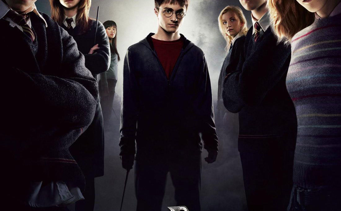

Harry Potter and the Order of the Phoenix movie poster
Warner Bros. has released the U.S. domestic Harry Potter and the Order of the Phoenix movie poster. The poster features “Dumbledore’s Army” flanking an older Harry Potter. The movie covers the fifth year at the Hogwarts school, with Harry and his classmates doing battle against evil Lord Voldemort.
Harry Potter and the Order of the Phoenix will also be showing in IMAX theaters. Apparently Harry Potter and the Order of the Phoenix: An IMAX 3D Experience will feature a 20 minute enhanced 3D finale. Speaking of 3D “enhancements”, star Emma Watson’s chest appears a bit larger in Harry Potter IMAX ads when compared to the Order of the Phoenix poster, even though they are both based around the same artwork.
Although Hollywood (and media in general) has a long history of “augmentation via Photoshop” in advertising, this instance is less obvious than other examples. But it is hard to resist pointing out Hermione Granger’s breast growth spurt in this case when the artwork is for a 3D movie from a theater chain with the motto “Think Big”. (This also invokes memories of a Saturday Night Live Harry Potter skit starring Lindsay Lohan from a few years ago.)
Why is there a difference between the two pieces of Potter key art? Since the IMAX version of the poster art appeared online before the final Harry Potter one-sheet, we can only speculate that Warner Bros. gave the IMAX ad group an earlier “comp” version of the artwork prior to being finalized for the studio’s own press run. There are other subtle differences between the two: the domestic one-sheet version of Herminoe Granger features a less flowing hair style, probably because her hair in the IMAX version blocks more of actor Matt Lewis (as Neville Longbottom) standing behind Emma Watson.

Actually, it looks like the poster artwork on the left is the altered version. Notice Emma’s hair in the left photo has fewer fringes and her face looks like it has on more makeup. I actually think they gave her a less-curvy figure on the film poster, in this instance.
bullshit. your seeing things that arent even there.
You got pawned! Deal with it. We all know Watson is the reason we all watch Harry Potter so of course her assets are accentuated (oh wait…did I just say what you think I said or did I say what everyone is suppose to say?)
Well, this article appeared on Digg.com and that caused the site to be unavailable for several hours. (The dreaded “Digg Effect”.) Should be working a bit better now.
Reading the comments at Digg gives a wide range of opinions about pointing out the differences between the two pieces of key art. :)
Well let’s think about it a bit. They are teenagers, and she has “grown up” a lot since the beginning of the series. I don’t know if you’re aware of the physical changes females go through with their bodies as they go through the teen years and hit puberty or not… but something tells me you don’t need someone to point that out ;) I agree that you’re seeing things that aren’t even there and agree with the other comment as well, that it actually looks like they’ve given her a less-curvy figure on the film poster. Anyway, I think you’re making a bigger deal than necessary.
She definitely gets less curvy in the final picture. As well as flattening her chest, they also pushed her stomach out a little. It’s a really minor change though, especially when compared to the changes made to her hair). I’m surprised anyone noticed, let alone bothered to write about it.
Actually, there’s no foul play here. No breasts were enhanced.
I just discovered that the two images are part of a stereo pair, which I’m assuming is for one of those 3-D movie posters you sometimes see at the theater.
I have explanation and a sample 3-D image here http://tinyurl.com/2cj9e4
The images are not “part of a 3D stereo pair”… :)
Ok, they are a “stero pair,” part of a 3-D image. :)
That’s very creative, jer, but not very realistic. The IMAX image was just release before they were completely done with retouching the key art. That’s all.
Looks like The Daily Mail saw fit to take our article and image(s) without citing us as a source/credit:
http://www.dailymail.co.uk/pages/live/articles/showbiz/showbiznews.html?in_article_id=452961
That’s lame that they took the story and pictures.
u have a really Bad ass page man.
Everyone who disagrees with the fact that these photos were retouched, or says that “it isn’t such a big deal”, is buying into the biggest bullshit lie. This girl is looked up to by 12-17 year old girls around the world and some idiot thought that the real key to selling tickets is to sex up a minor. It is obvious disgusting and not some 3-D stereo image. It is a disgusting example of using sex to sell movies, and making young girls feel that they need to have big boobs and a teeny waist at 15 or 13. Argue the technology issue all you want, you cannot hide the motivation behind the poster’s design.
Calm down Alana. I don’t think they were trying to “sex her up”. Look at the difference between the two. Her breasts are still there, the just tried to make her less “curvy”. I think she’s gorgeous, but I seriously don’t believe they did that on purpose. Anyway, that tone you, Alana, used in your rant sounds like….never mind.
Definite improvement.
To me, it looks less like they increased her bust size as they tried to make her look THINNER, which by proxy makes her bust look larger. For example (waaaay too much time on my hands here,) draw a straight vertical line from the most, uh, sticky-outy part of her bust up to her face. In both pictures, she only “sticks out” the same distance. But compare the most inward part of her stomach and shoulders, and you’ll see that those areas are “pulled in”.
What I wonder is if it was done in an attempt to make her look skinnier, or to make her look more busty. If done ONLY to make her look skinnier, then it’s still a bad example to set, but at least it can be considered a LITTLE more “innocent”. If they did it specifically to enhance her bustline, though. Yeah, then it’s a problem.
Looking at the left one, I do notice that its been touched up. Thats pretty interesting.
It’s very common for pictures to be touched up. I think in the untouched photo she looks bustier, but there are always tricks that professionals use. It does get me angry that they have tried to make her thinner, as she already had quite a slim figure. Also, Harry Potter should not be about sex appeal, there should have not been any need to enhance her breasts. Poor girl, imagine how embarassing all the stories about it must be for her…
She’s 17, so she is still growing, so her bust size would naturally fluctuate, but I don’t see the need to increase her breasts. Remember, she is playing a 15 year old girl in this film.
Who the fuck cares if Emma Watson’s breasts look bigger in one poster than in the other? I mean it’z stupid that people point these thingz out. I apologize for completely missing the point of this whole article, but it’z a bit moronic of you ask me. Harry Potter was never about sex appeal so they never should have tampered with Emma’s looks. Plus it’z not really encouraging for other girlz who might look up to Emma if they know that an international superstar with NATURAL beauty looks the way she does through computer alterationz. Emma Watson’s looks do not need to be enhanced because first of all, she is already extremely beautiful, and second of all, will that very miniscule change in her breasts help promote harry potter by THAT much? How ridiculous…
I think that this picture is just taken from a different angle. Her hair is different for a start lol. I don’t think they’ve done anything to breasts at all and to be honest what does it matter if they’ve done anything or not…I think some people look at things to closely and this is an example of just that!
dude, so what if they made her boobs bigger! I think they look smaller, cuz if you look in other pictures they a lot bigger than what they are in the posters.
i THINK IT’S THE LIGHTING ON THE POSTERS, ALL THE CHARACTER’S SPACING SEEPS TO BE DIFFERENT
BOOOOOOOBS!
I think that’s a mistake when editing the image but if it’s what they want…I don’t care! I loved Emma Watson and if they tried to do that may (preverts go to see the movie). I want to touch them lick them and kiss them. I loved you Emma! Her BOOBS are bigger, that’s better but I woonder if they make a little nipples!
emma watson is so hot
that is so lame.. get a life dude..
You people are stupid. These are two different pictures. When they take photos for a poster like this, they dont just take one photo, they take many. These are two different photos taken probably a second apart. In the one on the left, Emma is just sucking in stomach in a little more.
Everybody knows big boobs sell and little boobs suck so that is the reason her boobs got suddenly bigger (though not big enough to make me want to watch that POS move anyway).
It’s too bad really… I used to like tiny boobs but then I grew up.
Her hair was photoshopped too. Why, I can;t imagine.
This is crap. If you have a girl, you should ofcourse be allowed to shape her any way you see fit to make her more atractive in your own eyes.
She is your properta and you call the shots. If you don`t like her name for instance, change it.
If she is to fat, have her run while you drive slowly behind until she reaches the desired proportions.
There are a lot of things you can do to a girl to make her more atractive.
Be creative!
And forget about “feminism”.
Tiny tits looks better anyway, because tiny tits looks real.
Nothing is more discusting than silicon tits.
A 3d pair? or part of one? Really? You cannot be serious.
How do I know?
In the writer’s own words: “…sadly nobody actually owns the glasses required to see it. ”
What a great advertising ploy, putting all that effort into making an image that nobody will be able to see and therefore not be motivated into doing any thing with the images except discuss them on forums like this. Still, I suppose no publicity is bad..
You all are going bongers about Emma’s breast. In both pictures her breast looks same but first on the left she was breathing out and on the right she was breathing in. Got it?