The best movie poster of 2007
We came very close to declaring there was no “best” Movie Poster of the Year for 2007. Our annual pick for the best one-sheet for the year was coming up blank — there seem to be few choices for great movie posters. Looking at key art led to the same conclusion as looking at the movies themselves from the past 12 months: 2007 was not a great year for movies.
This past year, many marveled at the blockbuster eve candy of those sweaty 300 Spartans. Michael Bay’s Transformers was labeled a success mostly because the film was not as bad as many expected it to be. Many people searched eBay for a Spider-Man 3 lenticular 3D poster, which was as hard to find as a good review for the movie itself. Animation continued to be a dominant box office staple — three of the top ten grossing films of the year were Shrek the Third, Ratatouille, and The Simpsons Movie.
Vintage advertising showed its influence with the dime-store pulp of the Black Snake Moan poster. Quentin Tarantino and Robert Rodriguez wanted you to know how much they love the 1970s exploitation double-bills with the Grindhouse poster campaign. Were they trying to recreate the haphazard aspect of 70s B-movie advertising by creating a Planet Terror poster with Cherry Darling’s gun replacing the wrong leg?
Speaking of vintage, we liked the smokey distressed look of the 3:10 to Yuma movie poster, but is the sweeping (and blurry) duster jacket pose too Bob Fosse?
And speaking of blurry, some singled out the Michael Clayton movie poster as a good movie poster, but the blurred image of George Clooney with large typography seemed to fall into what some film ad creative directors call “book cover” design.

Artist Drew Struzan got to finish his own rejected Blade Runner poster design illustration from 25 years ago for the 2007 (limited theatrical, followed by DVD) release of Blade Runner: The Final Cut. The new Blade Runner DVD release features interviews with Blade Runner poster illustrators John Alvin along with Drew Struzan — a rare opportunity to see and hear film poster illustrators speak about their work. Alvin has some interesting comments about one-sheet design in the DVD’s Promoting Dystopia: Rendering the Poster Art documentary interview.
Topping many film critics best-of lists, Juno was labeled as “this year’s Little Miss Sunshine”. The Juno movie poster took that label by following the Little Miss Sunshine one-sheet example of “branding” itself via a strong color element (orange stripes in this case).
Was there a trend for 2007 movie posters? Our vote would be what we will call Big Sky Country, especially when looking at indie film posters. Lots and lots of big fields and big skies. All those vistas are not really a new trend, but there seemed to be fewer big heads floating in those skies lately.
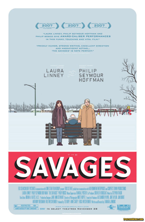
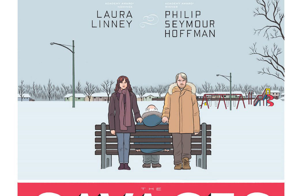
Which brings us to our pick for the top movie poster of the year — The Savages movie poster illustrated by comic book artist Chris Ware. The movie tells the story of the dysfunctional relationship of a brother (Philip Seymour Hoffman) and sister (Laura Linney) dealing with their elderly father. What is interesting about the poster is all the things generally considered no-nos used in the one-sheet that don’t seem to take away from Ware’s illustration. Blue type against a blue background? Check. Overused Bank Gothic typeface set too small for copylines? Check. Rounded corners a la web design conventions influencing print design? Check. Reminiscent of another comic book artist illustrated movie poster featuring Philip Seymour Hoffman — the Happiness movie poster by artist Daniel Clowes? Check. Overbearing title treatment? Check. Inconsistent type justification (using centered, left, and right justified text)? Check. And failing to pass the gold standard test in film advertising ad critique smack-downs: Would your mother understand it? Check.
What we do like about the Chris Ware movie poster illustration for The Savages is that it is different than most key art campaigns (mainstream, indie, or otherwise) — it evokes a real feeling and direction about the characters. The trademark Chris Ware style of detached “coldness” is (literally) on display in The Savages one-sheet. Ware was an interesting choice to illustrate The Savages movie poster, since a common observation about his work is that his cartooning isn’t as strong as his writing, or at the very least, his artwork is overrated. It would be easy to criticize this top movie poster choice as yet another fan-boy sucking at the Chris Ware teet, but anything involving an alternative “comix” inspired illustration in a film advertising movie poster campaign deserves support.

Man I have to disagree with selection chosen for 2007’s poster of the year. Not knocking the artist, but hand’s down, the poster of the year should have gone to the Blade Runner: Final Cut style, despite the fact that the image was “partly” created back for the 1982 release. Struzan never completely finished the painting, and director Ridley Scott loved it, as it was his favorite, but it was passed over for what is now known as the original release poster. The Struzan Blade Runner piece is amazing, and took the cake in my book. :)
Jon
Emerald City Movie Posters
Man I have to disagree with selection chosen for 2007’s poster of the year.
Well I think the opening statement in the post tells you how we feel about making this year’s choice. ;)
Your choice of Blade Runner — which reaches back 25 years for it’s origins in several ways — seems to echo the feeling that this year wasn’t a great year for new film key art.
Is the Struzan/Alvin interview on the bonus materials for the Final Cut 2-disc edition, or is it on one of the other discs in the 5 disc suitcase edition?
I realize after checking my post, I forgot the word “the” in my first sentence. Ugh. Just because the artwork was primarily done for the 1982 release of Blade Runner, technically it wasn’t used as a an official movie poster until 2007, after Struzan finished the artwork . Just my opinion but it was/is an amazing piece. To me, Savages is rather boring piece, nothing about it screams “Poster of the Year”. Another good poster in 2007 was the advance style for Captivity depicting the woman buried underground in a see-through like fashion. The film bombed, the poster was recalled, but it was a very interesting concept.
Jon
Emerald City Movie Posters
This is the post of the year for this website. Please post more often. I think we’d all love to know your thoughts on most of the posters out there as they are revealed by the studios.
Even though I didn’t like the movies, I thought all the work done for Planet Terror individually was great, and also on the old school/retro side I liked this poster for The Orphanage — http://www.impawards.com/2007/orfanato_ver2.html and the tinted profile one sheets for Summer Rain.
30 Days Of Night campaign was nicely done even if it did seem derivative of 300.
But I agree that this was a weak year for poster art. Most of the work just seemed incredibly half hearted and unfocused.
Chuck, did you mean you wanted me to post more often? LOL! How did you come up with the comparison of the 300 poster and the 30 Days of Night? They didnt appear anything like each other to me. The problem with 300 was mainly confusion among collectors….there wasn’t as many posters made as some made it out to be. People on eBay posting “wilding” posters claiming they were originals just made it more confusing for collectors because wilding styles are not originals, they are mass-printed versions that are put up just about on every street corner. That’s one of the problems with posters, and people on eBay or even some dealers, they think every image released is an official poster, when it’s not the case.
30 Days of Night was a good poster, the advance and final styles were the same, just the credits added to the final, I didnt see the film, but heard it wasn’t that bad. Grindhouse was a very good poster design as well, but was another one that suffered from multiple images being released all citing they were posters when in fact they weren’t.
Jon
The Savages is an interesting concept but it repeats some of the common elements from other posters; Big sky , small forground image, use of color. The 3:10 to Yuma Teaser not only uses an unusual and distinct color palate, the main figure in the poster is not facing front, and is not one of the stars in the film, The image is actually about the concept. Since this is not an election, it doesn’t get my vote but it did get respect. My favorite for the year. I’m posting for the first time, I love your site and subject, thanks for taking the time to pull stuff together.
of course I want you to post more often.
It’s funny you bring up wilding cause that’s were the 30 Days and 300 posters struck me as similar… on the streets. Not on a subtle level of course but the heavy use of black and red along with the 3-0 titles and comic origins so close together in time made me think the 30 Days designers were attempting to bottle some of the same lighting as 300.
In fact I prefer the 30 Days of Night posters, I think they have a great brutal simplicity to them.
… and ironically the 30 Days posters look more like Frank Millers stuff than the movie based on his work.
I agree about 3:10 to Yuma posters, both were nice styles, they did however cause some confusion, with my customers that is. The style with the train on it was the first style released, yet had the credits on it, so everyone assumed it was the final style, but the final style is generally the last style to come out. Some thought the one with the Bale/Crowe on it was the advance, but that turned out to the final. Maybe they should have called it 3:10 to Confusion. Very good film by the way, I heard it is one of the best looking Blu-Ray titles out there. When I make the jump to hi-def I will probably pick it up.
I still think Blade Runner: Final Cut should have been the top poster design of 2007. Even the IMP site (great place that is by the way) didn’t chose it as the best poster design. I was surprised.
Jon
Have to agree that The Savages is a great poster. ;)
2007 was not a great year for movies.
You may be right about key art, but any year that has great movies from the Cohen brothers, PT Anderson, David Cronenberg, Tim Burton, Sean Penn, Pixar, and as well as Atonement, Once, Gone Baby Gone, The Assassination of Jesse James, Borne Ultimatum, Hot Fuzz (for crying out loud), the Savages, Superbad, and Knocked up has to rate at least as pretty good — even if you hate Juno.