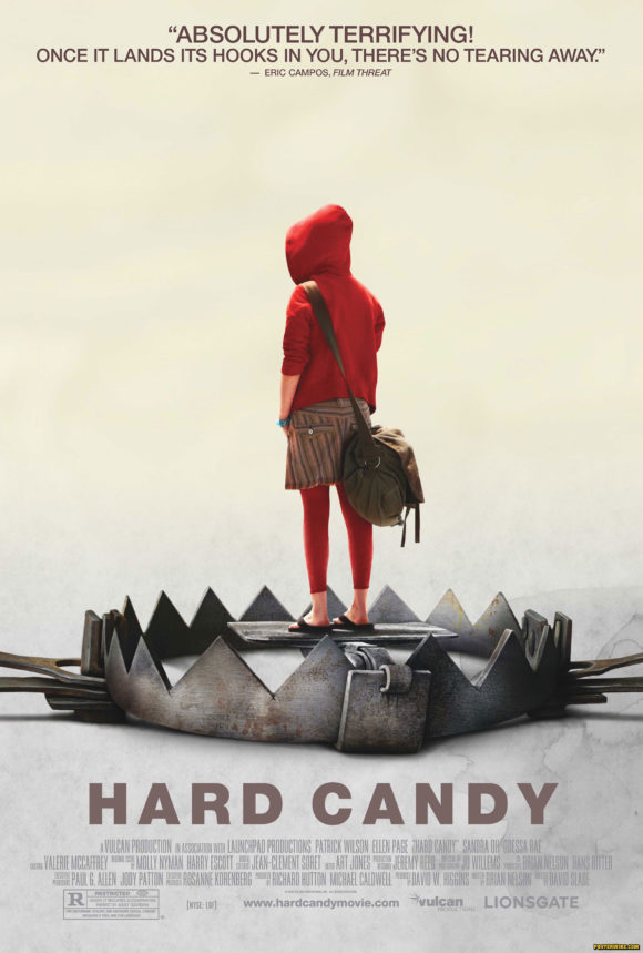
The best movie poster of 2006
It’s the end of the year and that can only mean one thing: We give out another award to Lionsgate marketing and Art Machine film ad agency just like we did last year. This year-end poster recognition is also known as the 2nd Annual Posterwire.com Movie Poster of the Year Award.
There were a few notable pieces of film poster key art from 2006. The “cut-out” teaser campaign for the movie Brick was interesting. A star sell here and there. The continued glut of animated films (and their posters). The “What can we get away with?” gore of modern horror posters. There were plenty of movie poster controversies, both real and fake.
An obvious choice for movie poster of the year might be the series of one-sheets for the film V for Vendetta. We love that each poster embraced a slightly different style and variation of vintage “propaganda” poster art, but a slight criticism might be the ad campaign felt a bit unfocused and like an exercise that only graphic designers and “fan-boys” would really appreciate.
Our choice for the best one-sheet of 2006 is the Hard Candy movie poster.
Technically we are a year off — the film Hard Candy (now available on DVD) first premiered in January 2005 at the Sundance Film Festival, but it wasn’t released domestically until April 2006.
Created by Art Machine for film distributor Lionsgate, the Hard Candy one-sheet features an image of a young girl (with an obvious “Little Red Riding Hood” look) as “bait” in a very large and lethal looking bear-trap.
One reason we admire this piece of key art is that it met the challenge of selling the film’s difficult subject matter visually: How do you design a piece of key art to market a film about an apparent “sexual predator” and an “innocent” underage girl and the twists and turns of their encounter? That logline doesn’t exactly beg for a “Big Heads Floating in the Sky” star-sell movie poster. (Although the other Hard Candy movie poster might fit that bill.) This leads to why many feel that smaller independent films can have a distinct advantage when creating a marketing campaign: without the benefit (or burden?) of big stars and big budgets, these types of films have an opportunity of being more creative in their advertising out of sheer necessity. That’s not to say all smaller films automatically have superior movie poster designs or better marketing — any film ad campaign can buckle under the three Rs of the movie marketing design process: “Review. Revise. Reject.” And larger films do use a bit of conceptual imagery on occasion, especially in the realm of teaser posters.
We may look like a “flog” heaping so much praise on Art Machine and Lionsgate, but they have produced several great one-sheet designs in recent years and picked up a few awards along the way. (They have had their share of misfires as well.)




IMPAwards is taking nominations for movie poster of the year if anyone would like to share their favorites:
http://impaward.proboards88.com/index.cgi?board=2006awards&action=display&thread=1167259672
Great poster!
Just saw this post… what was the Brick “cut out” campaign? Was this actually a poster, or was it a cut out from magazines?
Yes, all the Brick movie posters used that torn paper “cut-out” look for each of the major characters.