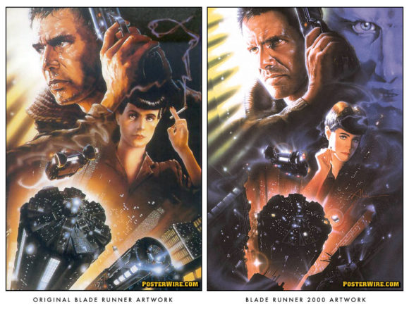
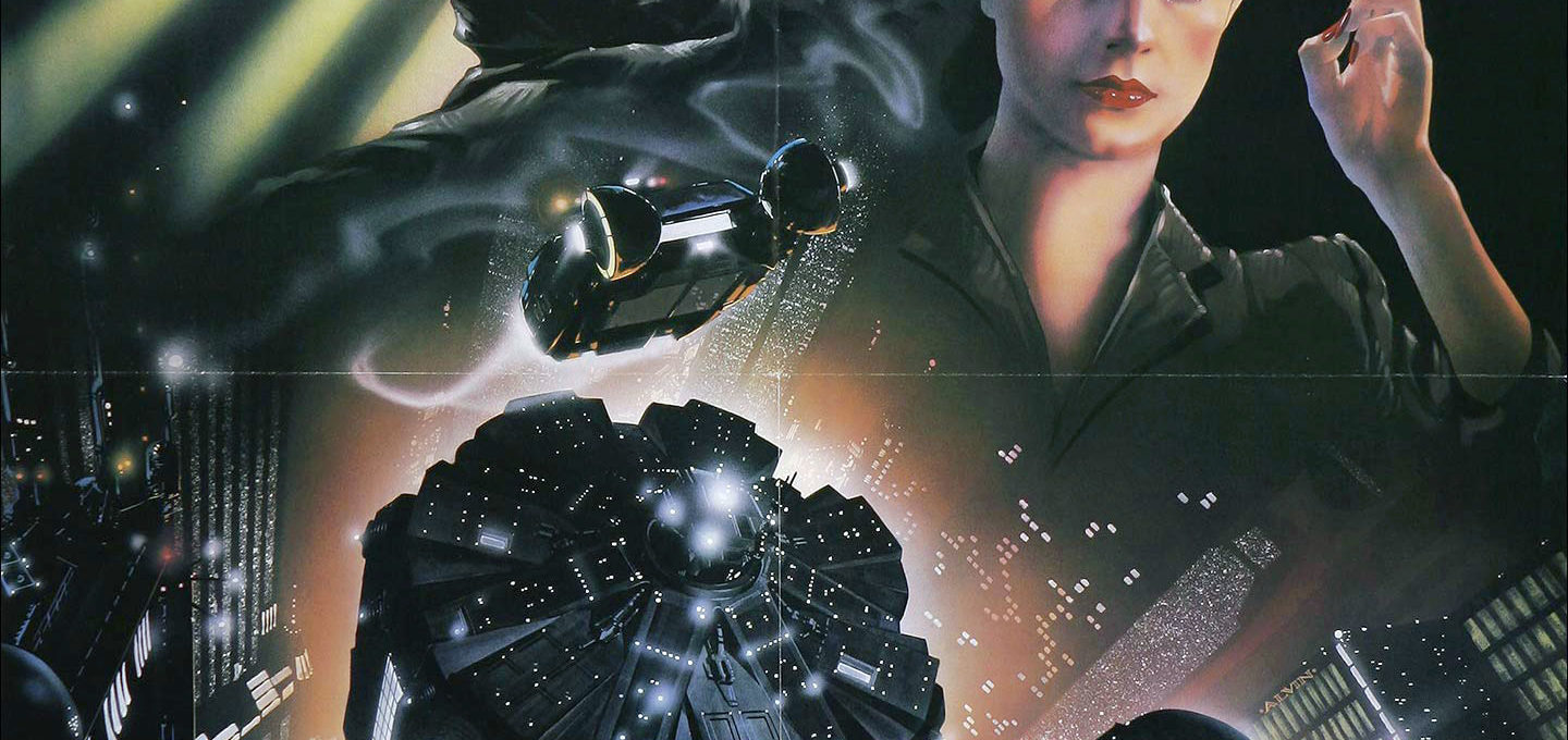
One of our favorite poster illustrators is famed artist John Alvin. Alvin is responsible for some of the most famous pieces of film poster art, including memorable one-sheets for E.T. The Extra-Terrestrial and the Star Wars trilogy. But his most striking work (and our site’s design inspiration) is his one-sheet poster illustration for the 1982 sci-fi classic Blade Runner.
Surprisingly, Alvin was never completely satisfied with his original poster art for the Ridley Scott film, and set out to revise and redo his original Blade Runner artwork in the year 2000. Alvin, speaking about revisiting past projects:
But in the same sense, a chance for the artist, in this case myself, to go back and recreate something that I always liked but wanted to do it a little differently at the time and circumstances didn’t permit.
Here is a Blade Runner movie poster comparison of the two versions of the artwork. Which version of the poster do you prefer?


The second one is a big improvement. The flow seems to be more evident. . .
Guess it might be a case of “too used to the one on my wall”, but for me the origanl wins out. On the reworking the top right colours just don’t sit right. It almost seems as if it was added just to fill the space – it feels off balance.
Maybe it would work better for me if the colours top right were reworked as less of a duotone, but I liked Rachel’s smoke – excellent scene in the movie and it fitted the poster really well.
I like them both, although Rachael appears a bit too “robotic” in the orginal with the way she is holding the cigarette. What really strikes me is the quote from Mr. Alvin, “…do it a little differently at the time and circumstances didn’t permit.” I wonder what the circumstances were? (i.e. Pressure from the movie producers, timeline constraints, etc.)
I believe the linked interview had Alvin explaining that he didn’t have a good photo reference for Harrison Ford — one of the circumstances he was referring to.
Unlike most fans, I prefer the first film and likewise I prefer the first poster. I think it is a memory thing. But bascially I like all things Blade Runner.
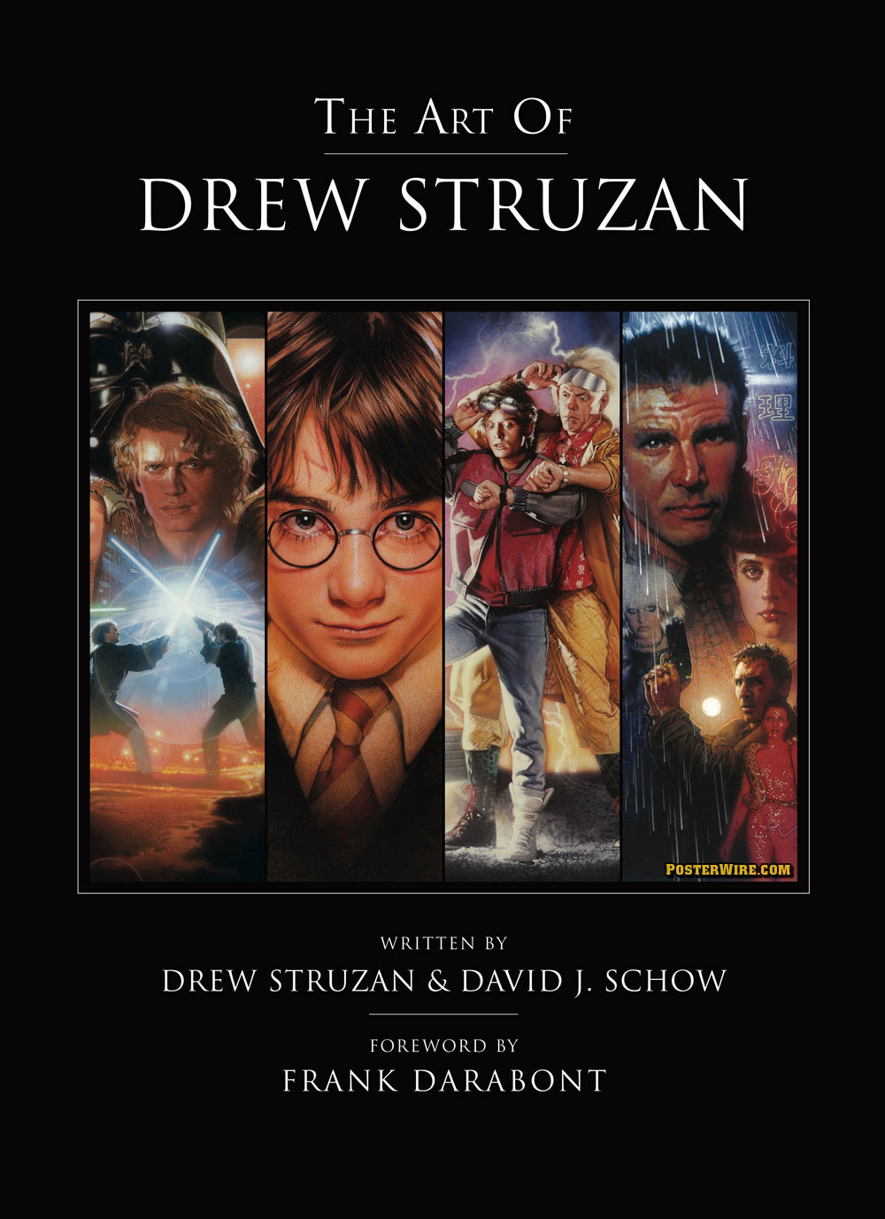
The artist for the Blade Runner poster is Drew Struzan.
Or so I thought.
The Blade Runner one-sheet is all John Alvin. (His best, in our opinion.)
Drew Struzan has done artwork for a Blade Runner poster before, however.
I still prefer the original art; though “Rachel” looks better in the second poster.
That said, I much prefer Drew Struzan’s artwork (seen on his website) for Blade Runner.
:)
Drew Struzan (The Goonies, Star Wars Trilogy, Indiana Jones, Harry Potter, Hook, The Cannonball Run, E.T.) Did the better artwork, which is finally on the new DVD!! A 25 year mistake finally rectified. Ridley Scott always prefered Drew’s to John Alvin’s version. The studio wanted John Alvin’s version, but he is better at painting landscapes (Cocoon, Jurassic Park, Twilight Zone The Movie, Gremlins, E.T.).
I prefer the original, for nostalgic as well as artistic reasons – it’s simply better.
Yes, Harrison Ford is more recognizable in the new one, but the cheery poster style and his smile don’t fit the mood of the movie. He has to compete with Rutger Hauer for attention, now placed left to the image axis. Rutger’s blue and the yellow on the left corner don’t go well together.
Bad redesign, or rather a photoshopped copy of the old classic.
The second one definitely.
For over a decade I’d look at my Blade Runner soundtrack CD’s cover and think, “I could do better than that,” and “Why are there sunbeams coming from Deckard’s face?”
Now both faces are more photorealistic and less robotic. You can see more of the cityscape and get a sense of the scale of LA 2019. The most malevolent image of Roy Batty has been (appropriately) included. And those sunbeams, are now light coming through blinds (very Noir). A gorgeous improvement overall.