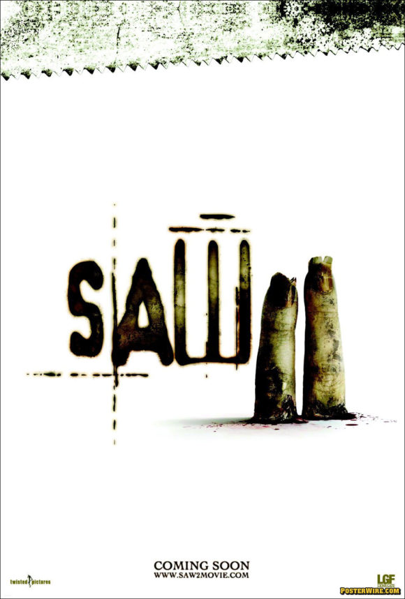
The best movie poster of 2005
Since it’s the end of 2005, why not have a 1st Annual Posterwire.com Movie Poster of the Year Award? (Well, we can think of a lot of reasons why we have no business doing things like that, but still…)
It’s difficult to define what constitutes “best”, or even what makes a “good” movie poster. Is it what’s most visually appealing? Strongest conceptually? What helped market the film best? (Which would be a good movie poster’s ultimate goal.) If asked what artwork they liked best, the average movie patron would simply pick the poster for their favorite movie of that year. (This explains why so many Titanic movie posters graced the walls of more than a few teenager’s bedrooms years ago… Yes, we’re still taking shots at Titanic.)


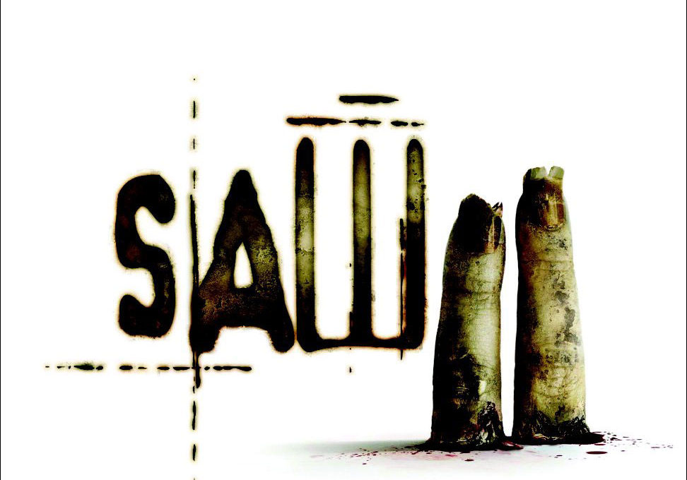
But ultimately, our choice for the best movie poster of the year is the Saw II teaser poster. It fulfills all of the previous qualities we mentioned. The artwork is very well executed (and very creepy looking) — we’ve always enjoyed the fact the Saw posters used a clean white background (normally a staple of comedy movie posters) to give it’s “parts” that much more visual punch. And as far as concept, who doesn’t enjoy the dark wit and parody of the two fingers representing the “Two” of the sequel’s title? The two fingered sequel poster being another common staple of film key art. (And to take this idea even further, the Saw 2 poster itself has already been parodied.) Finally, if there is no such thing as bad publicity (especially when it’s free), then no other poster this year made the news for being banned by the MPAA, which was the case with this Saw 2 one-sheet. The MPAA approved revision of the teaser poster is still effective. We have no idea if the banned artwork was just a bit calculated or not, but the result certainly didn’t hurt the film by getting it that much more exposure. (To be fair, it probably didn’t generate any additional business for the film, but since the key art is only a tiny part of the overall marketing effort, it’s important to note that it meets the criteria of “every little bit helps”, especially when trying to generate awareness of a lower budget horror film.)
A well-designed, clever horror poster that generated it’s own small controversy and buzz — that sounds like a winner to us.

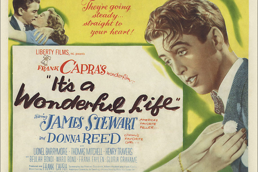
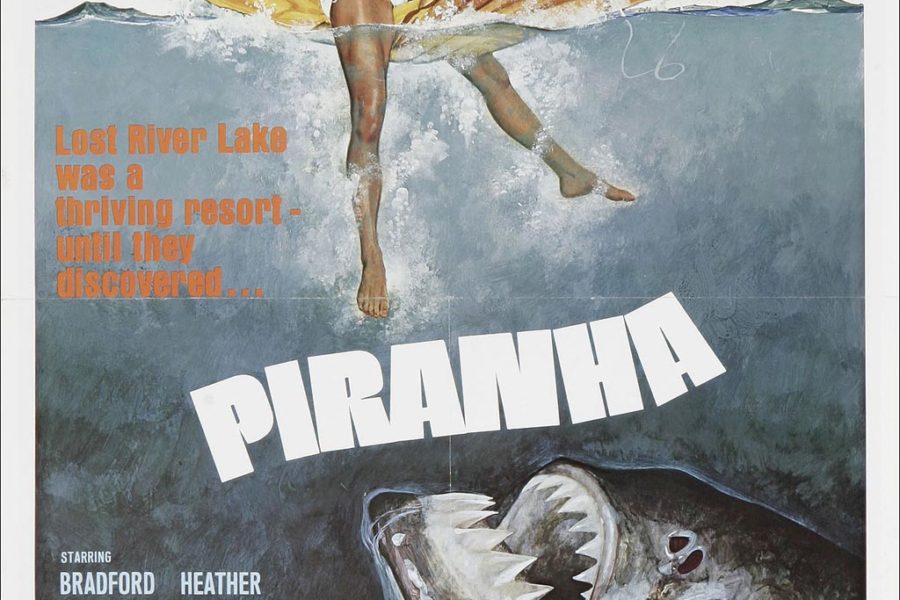
Also wanted to invite everyone to comment and share their favorite poster(s) from the past year.
I agree. And I want to add that I absolutely love this site!!!
“(To be fair, it probably didn’t generate any additional business for the film, but since the key art is only a tiny part of the overall marketing effort, it’s important to note that it meets the criteria of “every little bit helps”, especially when trying to generate awareness of a lower budget horror film.)”
But key art is the KEY factor in a DVD titles’ success on the shelf. It is often the ONLY part of the movie that a retailer looks at. Let’s be fair and say that while SAW did great at the box office – it SLAUGHTERED on DVD, and that’s why the sequel was made.
Well, DVD cover art does take on a more important role when compared to domestic one-sheets. But you mentioned retailers specifically, and what they’re more interested is in a title’s DVD sales tear-sheet they receive from the studio that breaks down how many units they can expect to sell citing various factors, including domestic box office, past performances of similar studio titles, etc. They do not base their order of “units” purely on the key art.
Since the importance of DVD sales to a film’s earnings has increased so much over the past few years, we’re already seeing a shift of home video marketing. Now we see trailers/commercials, press tours, and actor talk show appearances to promote a film’s release on DVD — that was unheard of two years ago.
But yes, a great piece of DVD packaging helps too. ;)
I was the director of marketing for a DVD company for two years. I, working with a very talented group of graphic artists designed key art, sell sheets, video and DVD sleeves and casewraps, etc…
Because the company was small, we maintained contact with key retailers and distriutors across the country. We had an event in conjunction with VSDA and had packages of our movies for the key retailers, and screened a trailer or two for the new titles coming up. The trailers weren’t that well received and we thought we had just commited Video Hari-kari. But…
Of the thirty retailers that came to the event, eight of them asked to see the key art of the trailers we had just screened. When we pointed it out in their packages the general consensus was, “Oh yes, that will sell.” The evening turned out okay as we turned the focus around to the art and not the trailer.
While key art is not the only factor – for most retailers (at least those stocking indie product) – the key art is the “deciding” factor.
Bill, it’s always interesting to hear from someone who has worked in some part of the biz.
How many years ago was your VSDA experiences? Because, sadly, there are fewer small retailers these days — the death of the “Mom and Pop” video store. (And if Netflix has it’s way, one of the biggies will die off too.)
All of the big retailers have so much more control over the studio’s campaigns and DVD releases. (I believe Wal-Mart won’t stock an “Unrated” title if there isn’t also a “Rated” version to sell.)
Anyway, I’m not belittling DVD key art and home video advertising — of course the box art can make a crucial difference when placed on store shelves — but you have seen the shift in the way DVDs are marketed in the past year or two, no?
Someone visits Netflix and remembers they want to rent THE GRUDGE, not because of the “box art”, but because they saw a commercial for it on TV last night with Sarah Michelle Gellar. Even smaller films like Saw will rely on generating word-of-mouth via horror fans, which takes a lot more work than just good key art. (None of us saw the Blair Witch Project because of the poster art, did we?)
Studios make most of their money via DVDs — so that’s where all the advertising dollars seem to be moving to. It seems like every other film commercial on TV ends with “Coming to DVD this Tuesday.” rather than “Opens in theaters this Friday.”
Then you have the other recent trend of straight-to-DVD releases, such as American Pie: Band Camp, which is a whole other topic.
The point of all this is, we agree that key art (via DVD or otherwise) is important, otherwise we’d have no web site. ;)
I would have to put the Walk the Line teaser poster right near the top. The artwork is simple and immensely cool.
There has been a trend of very expensive promotion for “DVD Premiere” titles like the LILO & STITCH sequel and the MULAN one. The DVD business is the largest growth sector of the business accounting for $28Billion. Theatricals account for $9B. Tv accounts for $16B.
No doubt that Netflix has changed the business model a bit. Video-On-Demand is going to change it even more.
You’re absolutely right that VSDA has changed too. This was waaaaaay back in 2001 and we’re talking KEY retailers – BB, Hollywood, Borders, Hastings, BB franchisees, etc – not Mom & Pops. It’s no fluke that BB won’t pick up an indie title until it’s been seen, rated by the MPAA (unless it’s obviously family fare), and they have a chance to approve the artwork. Yes, they judge the art. It’s that important.
In fact, we once did a special for Hollywood Video where we did a key art just for their stores. They didn’t like the art we originally came up with for the film and wanted something different so they could position the film in a different category slot.
And yes, we do agree key art is that — key.
Well I did like the Sin City posters a lot, even if they did use the “Comics sans” font- which looks ridiculous in large point size and just contributed to the detrimental “comic-book” stereotype. It was just one step above using “Biff!” and “Pows!” to me, really. (By the by, did anyone notice how similar the poster for Bruce Willis’s HOSTAGE and his SIN CITY poster were? Furthermore, the opening title sequence of HOSTAGE had much in common with Sin City too heh, imho).
Another poster I really liked was the teaser poster (or maybe it was only ad art since I first saw it in Entertainment Weekly) of ICE HARVEST. I liked how they cut both lead actors in half, with Thornton half visible on the left side, pulling the trunk, and Cusack on the right side, cut in half as well. I thought it was a very arresting visual.
this site is exactly what i need…
all about movie poster.
I like the Match Point one sheet as well.
HAPPY NEW YEAR!