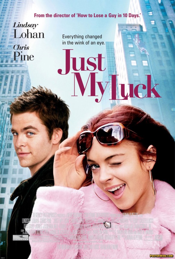
Lindsay Lohan’s “Wink”
The Hollywood gossip blog Defamer.com points out that the new Just My Luck movie poster showcases Lindsay Lohan winking at the camera, which signals the message that Lohan will be showing you a fantastically good time in said movie. In fact, Lohan seems to be sending out this signal with a wink of her eye quite a bit. It remains to be seen as to whether Lindsay can trademark “The Wink” as a movie poster marketing look (see the Herbie: Fully Loaded movie poster and Confessions of a Teenage Drama Queen poster).
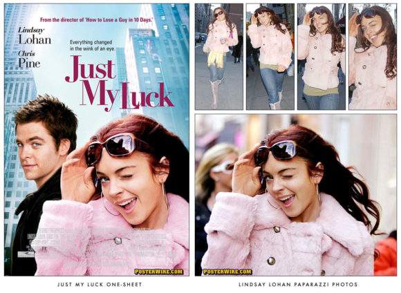
What’s interesting about the Just My Luck poster is that Lindsay Lohan has a paparazzi photographer to thank for her one-sheet movie poster image:
Lindsay Lohan may have had problems with the paparazzi, but that doesn’t mean she won’t use their help in promoting her new movie. I’m told that the photo of the 19-year-old starlet on the poster for ‘Just My Luck’ is actually a paparazzi shot from more than a year ago. Lohan sat for an official photo shoot for the poster — she even wore a red wig for it because she had gone blonde by then — but a source tells me the images were rejected because “they were too high style.” The studio asked for another shoot, but someone suggested a paparazzi shot of a winking Lohan. Not only did everyone apparently agree that the pic captured the movie best, but it even inspired the film’s tag line: “Everything changed in the wink of an eye.”
The paparazzi photo of Lindsay Lohan used in the Just My Luck movie poster was taken over a year ago on Madison Avenue by New York Post photographer Larry Schwartzwald. As always, he wasn’t the only celebrity photographer there to capture Lohan out shopping. Since paparazzi photos (and most any other type of news photographs or “photocalls”) are available for sale and licensing by publications and other outlets, it’s not unheard for a film studio to use this type of third party photography of actors. Although, this type of candid photography tends to be an image source of last resort.

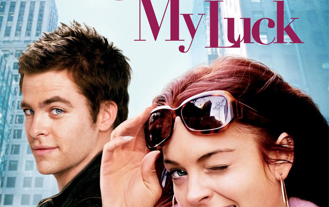
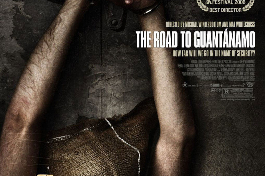


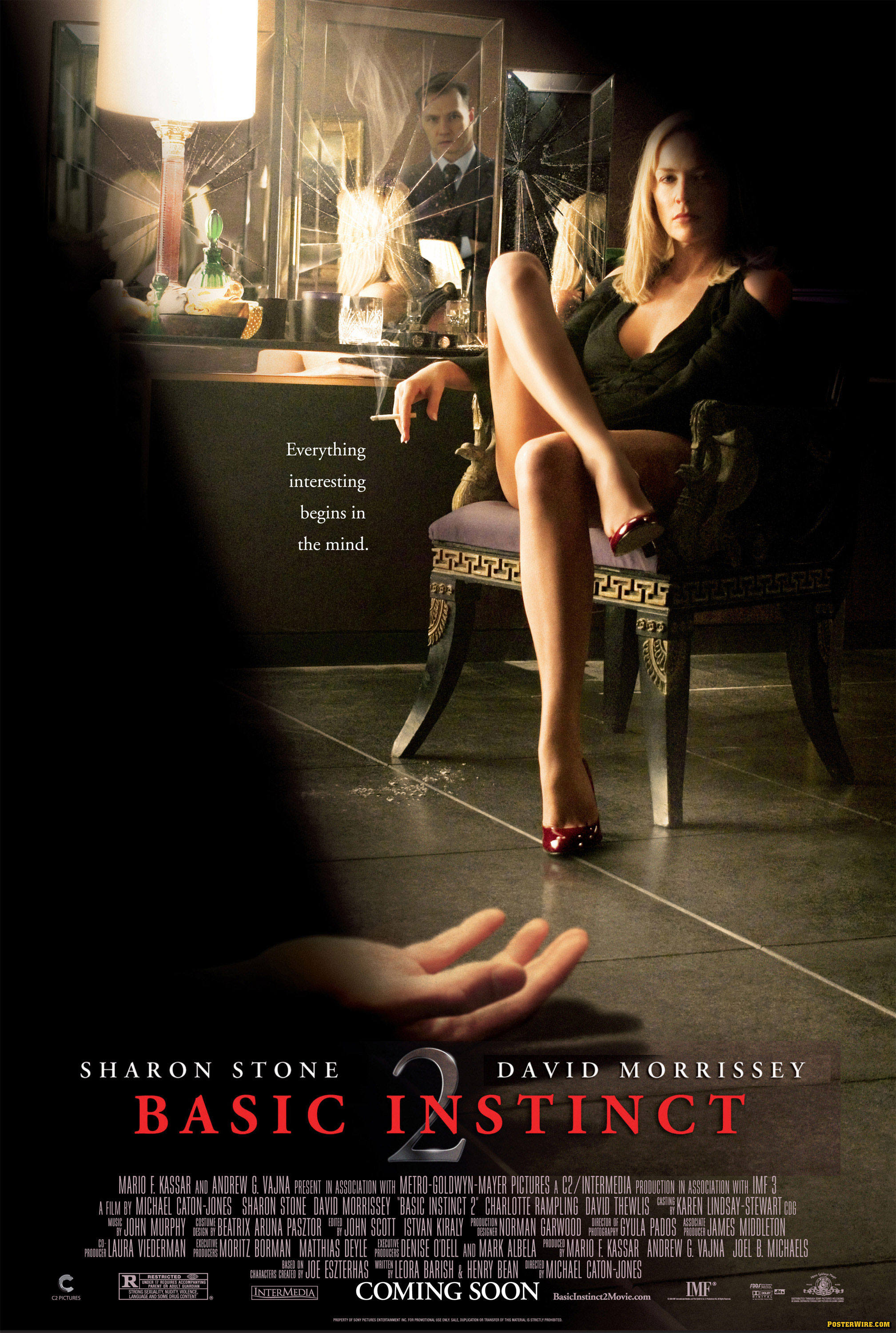
All well and good, but who was the designer on this piece. What was he thinking about with the lack of contrast with the credits at the bottom of the poster?
Well, it’s difficult to judge looking a small image of the poster on your monitor to make a call about contrast of a credit block — but this type of (un)readibility isn’t uncommon.
Regardless, if it’s difficult to read, the fault may be more directed at the film’s advertising account executive(s) (and maybe the print production manager), not the art director(s) or designer(s).
Hehe, just looked at the comments and was confused how I’d managed to post a comment without remembering it!
Looks like you have two readers called Benn. Posterwire is truly blessed!
Heh, and alternate Benn is also from Australia! First Benn I’ve ever come across on the interweb.
Enough spamming of comments for one day I think.