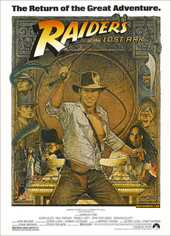
The Art & Artistry of Richard Amsel
To honor the premiere of the new Indiana Jones and the Kingdom of the Crystal Skull teaser trailer, we wanted to direct everyone to a new online article about artist Richard Amsel, who illustrated two of the original Raiders of the Lost Ark movie posters. From the author of the Richard Amsel article, Adam McDaniel:
The key to his success, beyond raw talent, was the unique quality of his work and illustrative style. Amsel could perfectly evoke period nostalgia (his posters for THE STING and westerns such as McCABE AND MRS. MILLER come to mind), while also producing something timeless and iconic, perfectly befitting both something old and something new. And however different his approach from one assignment to the other, all would bear his instantly recognizable stamp.
Although Amsel illustrated one of the most recognized movie posters of all time (in addition to many other one-sheets), perhaps his greatest exposure was a record breaking run illustrating TV Guide covers in the 1980s. This work for TV Guide marked the last era for illustrated covers for the television magazine, just as the era of traditional illustration would soon end for movie posters.
The McDaniel tribute makes for an interesting read — it was nice to see comparisons between Amsel and American artist J.C. Leyendecker. Although he worked in the same mediums as other illustrators of his time (watercolor, acrylic, airbrush, and color pencil), the “crisp” detailed and flat lighting style Amsel often employed is something that alluded many artists. To see a great example of this type of the detail, look no further than Harrison Ford’s face right down to the whiskers in the domestic Raiders of the Lost Ark one-sheet. Amsel’s Raiders work is an interesting contrast to the dynamic lighting style of Drew Struzan’s recent Indiana Jones and the Kingdom of the Crystal Skull poster.

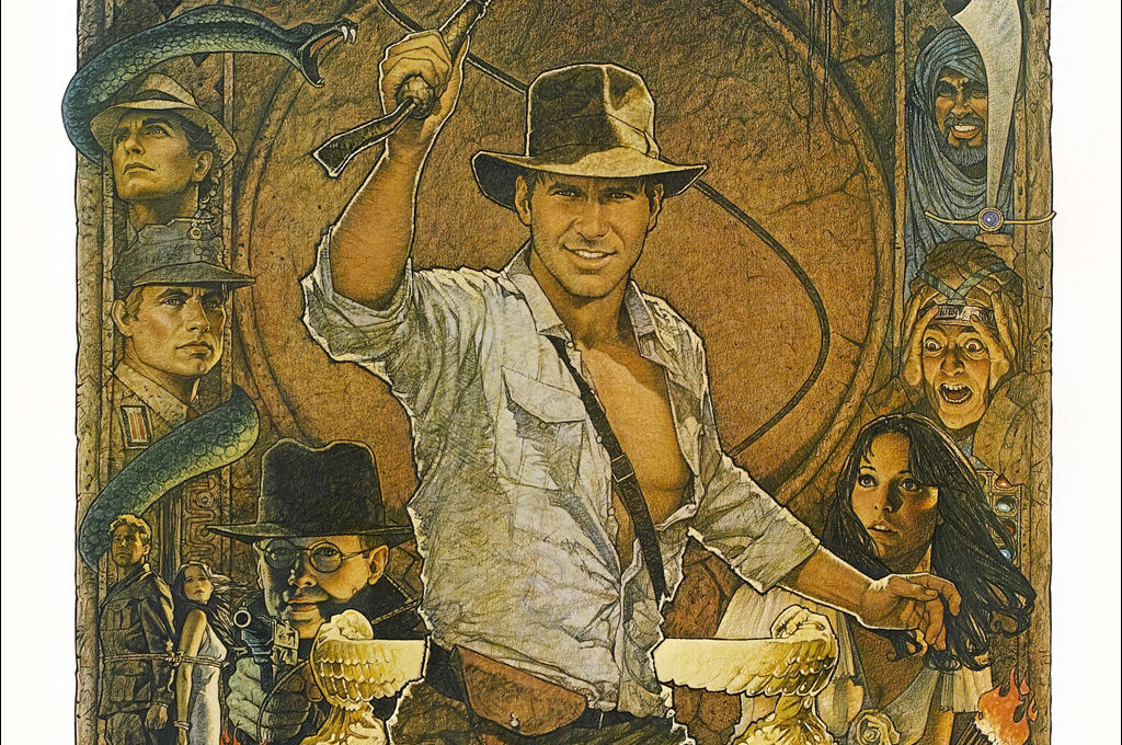
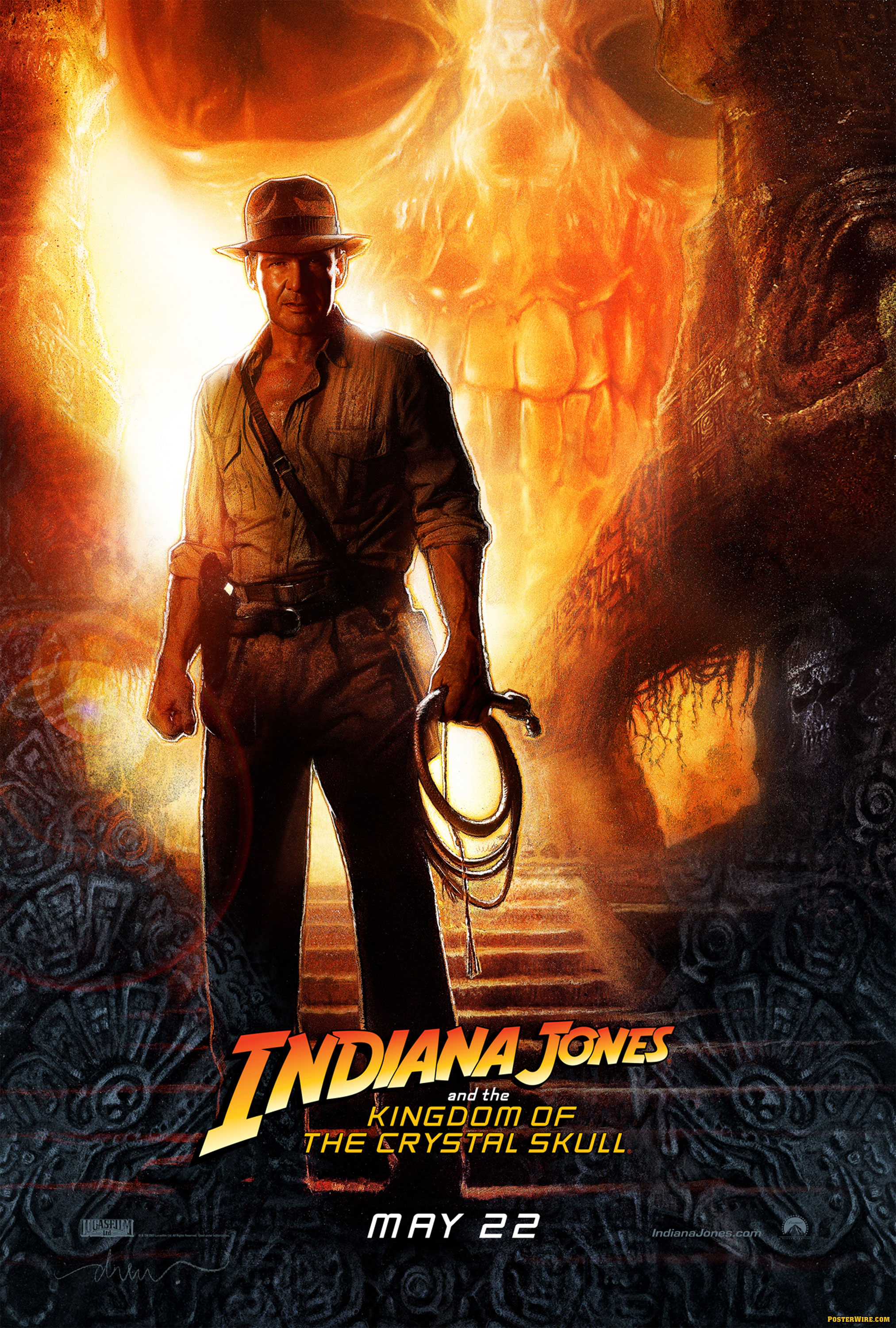
I wonder if the “dynamic lighting” we see is a response to the increasing influence of digital tools such as Photoshop, which lend themselves to more dramatic effects that would be more difficult to achieve with “pen and paper” tools. I’m reminded of a satirical jab in a Penny-Arcade strip [NSFW-cussin’] Photoshop Hero
However, in the case of the teaser poster, I imagine the dynamic lighting is there to help massage Ford’s appearance?
I saw the trailer yesterday and interestingly, they used a dramatic pull-out on a backlit image of Indy’s figure right before the title shot, which strongly echoed the teaser poster. I wonder if there was synergy going on there. I’m reminded of the STAR WARS III poster which showed Anakin and Obi-Wan clashing blades, an image played up in the trailer as well as a final shot before the title.
And speaking of the title logo- CGI 3-D Indiana Jones logo. Perhaps that’s why the logo font has been tweaked–it’s been tweaked into 3-D in the trailer so it needs to sync up on the poster?
Well, if you look at Drew Struzan’s work, particularly his more recent illustrations, you’ll see he makes heavy use of lighting effects — chormas, lens flares, bursts, etc., and not just in a “teaser poster” setting.
This could be partially traced to an influence of lighting effects via Photoshop in modern design, but I think it also seems to come from his use of (an actual) airbrush, which I believe he uses extensively. I haven’t seen an airbrush artist yet who didn’t learn how to put in some sort of glow or “aurora” in their work. ;)
By comparison, Richard Amsel work is flat with regards to lighting in most cases. Everything is lit so starkly and head on as if the subject is always standing in front of a large lighting rig with no “dynamic lighting” whatosever.
As for the trailer animating the teaser poster look of Indiana Jones at the end — that looks like the same situation where Spielberg had the original MEN IN BLACK trailer logo animated (with Will Smith and Tommy Lee Jones stepping in front of the MIB) and insisted it also be used in the movie poster. Perhaps it’s a scene from the movie they put into the trailer and directed Struzan to illustrate from as well.
To further go off topic, here is another example of the MPAA sometimes hates guns: This is a screenshot comparison of the U.S. and International version of the Indiana Jones and the Kingdom of the Crystal Skull trailers where they used CGI (and a bit of cropping) to remove guns from the U.S. version of the trailer. (via C.H.U.D.)
Ah, that’s right, I forgot about the MIB poster and the trailer transition.
One thing about “directing” Struzan to illustrate things is that he works off many photo references, so if the set photography shows something, it may end up in Struzan’s illustrations.
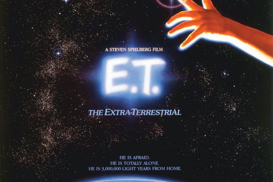
Interesting about the guns. Ironic considering Spielberg’s removal of guns from the re-release of E.T.
To go further off topic in a different direction, has Posterwire ever done anything about Hugh Fleming’s work?
Just wanted to let you know that I’ve now updated the Amsel gallery to include nearly all of his 40 covers for TV GUIDE. (It was a heck of a job scanning and editing everything!)
Oh look…
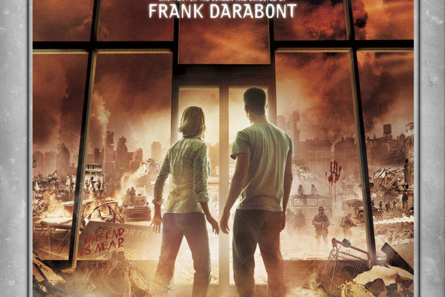
Morgan Spurlock’s latest movie poster…
For those interested in more about the life and career of artist Richard Amsel, I’ve just updated my online article to include new, extensive interviews with former classmates, friends, and (best of all) Richard’s brother, Michael.
I hope you’ll give it a read. The new interviews are really something, with some poignant and funny stories on Richard’s life.
http://www.adammcdaniel.com/RichardAmsel.htm