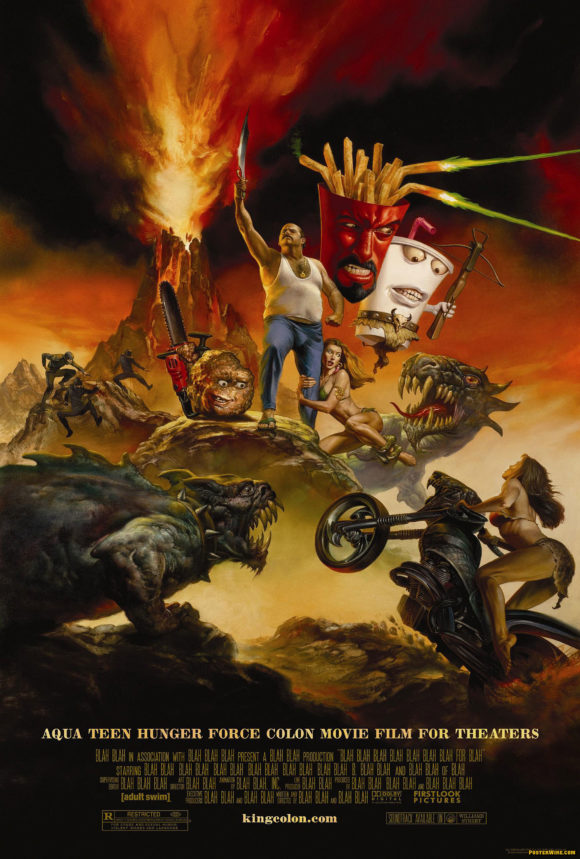
Aqua Teen Hunger Force movie poster
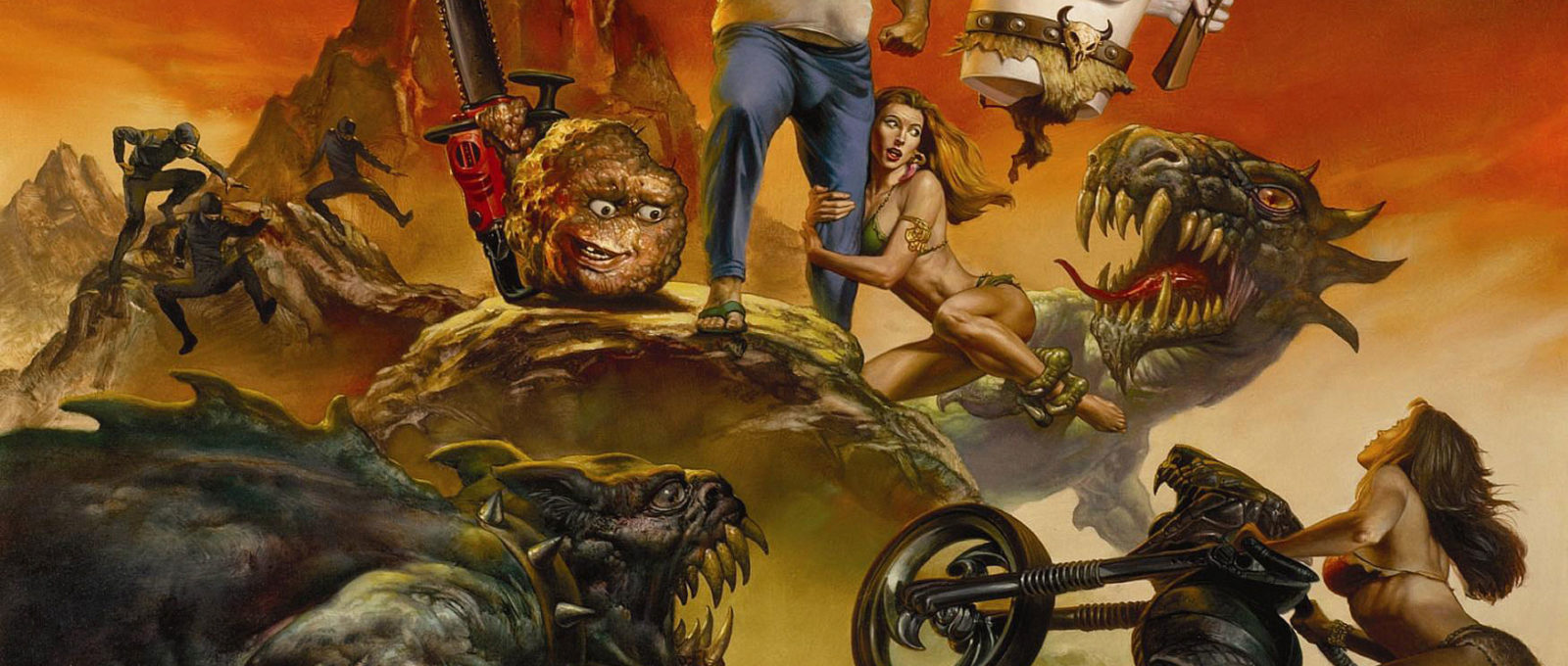
According to Film Junk, the new Aqua Teen Hunger Force movie poster was created by illustrator Richard Corben.
(Update: Richard Corben did not illustrate this poster. See update below.)
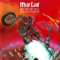
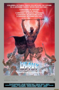
makes would have made for an interesting choice as illustrator for the Aqua Teen Hunger Force poster art. In the late 1970s, Corben created the art for a short story series called “Den” that was published in Heavy Metal magazine. His story was later adapted as one of the segments in the animated Heavy Metal movie. That movie story segment was the basis for a Heavy Metal movie poster, which was also created by, you guessed it, Richard Corben.
The Heavy Metal movie poster artwork features a triumphant pose of muscular hero “Den”, towering over a mound of creatures as an attractive female clutches his leg.
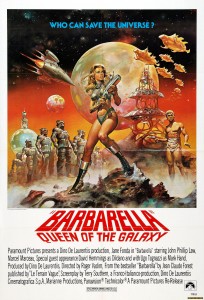
The towering hero layout Corben used should be familiar — it is sometimes known as the “King of the Mountain” or the “Conan the Barbarian” pose, since it’s origins go all the way back to pulp cover illustrations for Conan the Barbarian paperbacks and other similar magazines. This type of composition is so prevalent (especially in the realm of science fiction and fantasy art) it would be impossible to list every example of this theme. Although many artists (like Corben) work in this realm, the two most associated with this type of work are legendary illustrators Boris Vallejo and Frank Frazetta (both movie poster illustrators in their own right).
In the Aqua Teen Hunger Force movie poster, the ATHF team of Meatwad, Carl Brutananadilewski, Frylock, and Master Shake take their place on the mountain, complete with the required fantasy “babe” clutching Carl’s leg. No word as to whether this ATHF ad has caused panic in Boston.
Update: We received an email from Richard Corben’s official site saying Corben did NOT create the Aqua Teen Hunger Force movie poster. We later received an email from Boris Vallejo’s official site confirming that the Aqua Teen Hunger Force film poster was illustrated by Julie Bell and Boris Vallejo. Glad the confusion has been cleared up.

I’m pretty sure you’ll find that the poster was illustrated by the aforementioned Boris Vallejo, he of “Vacation” fame, if I’m any judge. And judging by the blending on the giant floating junk food, I’d be surprised if his partner Julie Bell didn’t have a hand in this as well.
The email from the Vallejo official site confirmed the painting was primarily done by Julie Bell along with a “combined contribution” with Boris Vallejo.
And let us just say that the (mis)information and revising of this article points out just how annoying and frustrating it is to identify designers/artists (especially illustrators) in an industry that keeps them anonymous.
Bloggers who genuinely can’t tell a Corben apart from a Vallejo (or spell “Vallejo”) don’t help, either.
Another excellent post. I really enjoyed reading the background on the Conan movie poster too. Thanks for that link.
Bloggers who genuinely can’t tell a Corben apart from a Vallejo (or spell “Vallejoâ€) don’t help, either.
Our poor spelling is well documented — thanks for the heads-up.
The comment about telling a “Corben apart from a Vallejo” — notsomuch. Mr. Vallejo emphasized in his email this artwork was more of a “Bell” than a “Vallejo”. Until we heard from both Corben and Vallejo via email, this was all “genuinely” just speculation.
This reminds me of another Adult Swim movie poster mashup, for the episode of SeaLab 2021 “TinFins” they made this Star Wars: Episode IV inspired design.
TinFins Movie Poster
“genuinely can’t tell a Corben apart from a Vallejo”
i didn’t know it was possible to sound like an art snob when talking about movie posters but there you go
Thanks to Internet Movie Poster Awards for giving us an updated/better image of the movie poster. Interesting that the credit block is full of “BLAH BLAH” instead of real names in the credits. Don’t know how they got away with that if that’s real.
There’s no title treatment on this version, so a legal billing block wouldn’t be triggered.
There is a small title above the credits, so a legal billing block would be “triggered”, no?
Did this poster get updated or am I blind? Probably, I’m blind. Although the version of this poster on http://www.impawards.com has been updated. It has a real billing block now (it had “blah, blah, blah earlier). Sometimes posters start to make the rounds on the internet before they’re truely final. maybe that’s what happened here? I kind of doubt it, but I suppose it’s possible.
While this parodies all of the above, to me, this most clearly parodied Meat Loaf’s recent “Bat Out of Hell III: The Monster is Loose.” BTW, that would make sense considering that Julie Bell and Boris Vallejo did that one, too. :-)
FanO