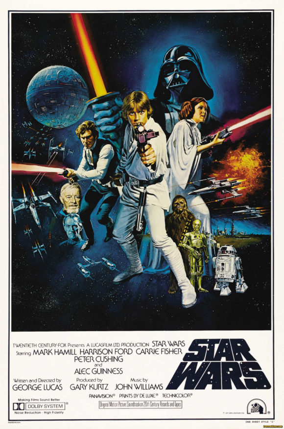
Star Wars Trilogy DVD covers
The “internets” have been abuzz about the recent Lucasfilm and 20th Century Fox announcement that the original non-special edition versions of the Star Wars trilogy — A New Hope, The Empire Strikes Back, and Return of the Jedi — will be released on DVD for a limited time. While these “Original Unaltered” DVDs sound great on paper (they could be called the “Han Shoots First” editions), details about the release have fan-boys feeling “a great disturbance in the Force, as if millions of voices suddenly cried out in terror and were suddenly silenced.” The complaints being these DVDs will be using old non-anamorphic transfers last used for the 1993 Star Wars laserdisc releases and also include the previous Special Editions, meaning fans will be buying duplicates of what they already own.
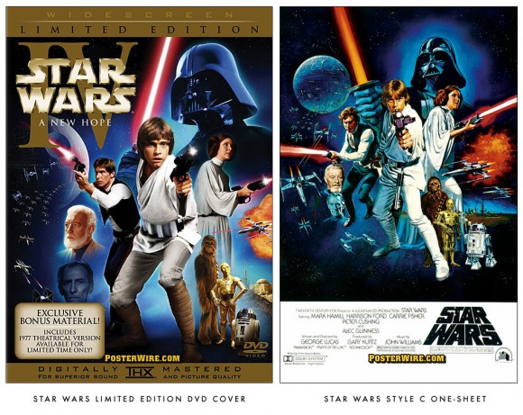
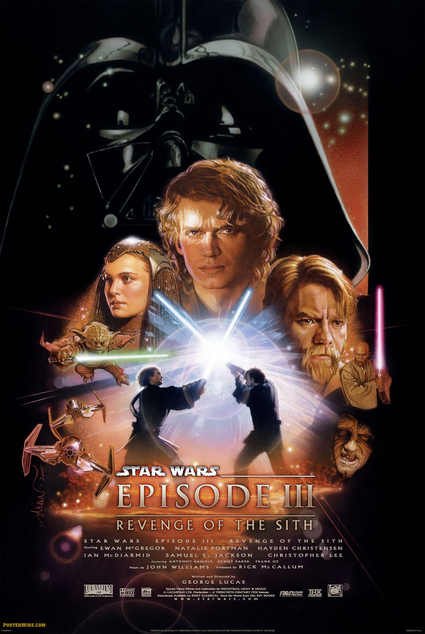
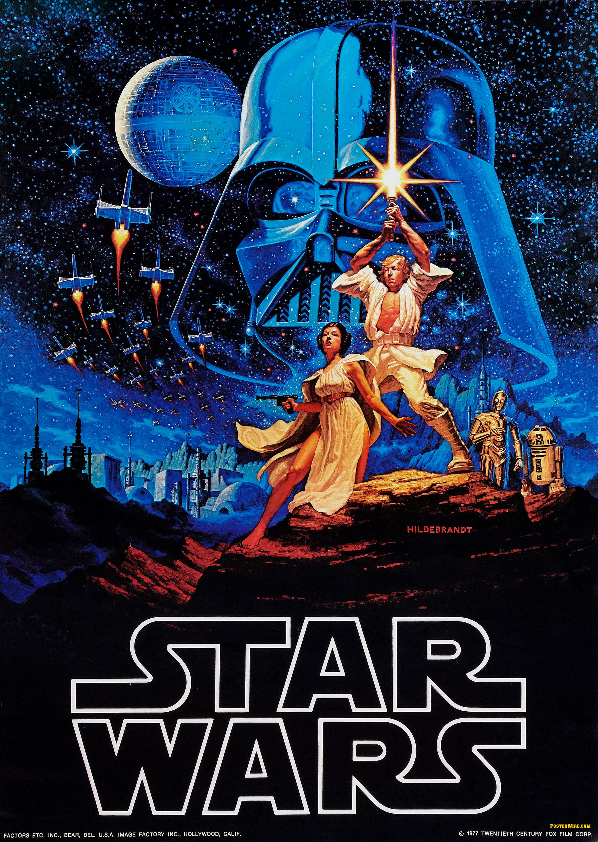
The DVD cover art for the upcoming “Original Unaltered” Star Wars trilogy features photo composition style covers, rather than older illustrated poster artwork used for the original theatrical one-sheets. This continues the Fox Home Entertainment trend of doing photo based DVD artwork for Star Wars releases on DVD.
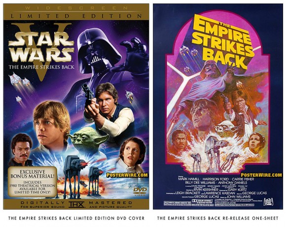
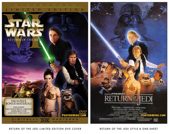
You can see a side-by-side comparison of the new DVD cover versions of the Star Wars Style C movie poster (originally illustrated by artist Tom Chantrell), the 1982 The Empire Strikes Back re-release movie poster (originally by artist Tom Jung), and The Return of the Jedi Style B movie poster (originally by Kazu Sano).
Looking at these photo compositions, we can imagine the pain of the art director(s) having to search through the empire-sized Lucasfilm photo archives to find images of specific character poses to match the vintage Star Wars one-sheet artwork they were trying to recreate. Which leads to a common question: Why do film studios sometimes create new artwork for DVD releases rather than using the original theatrical one-sheet key art? There are a myriad of possible reasons, the most common being the film studio’s home entertainment division is interested in “improving” (and in some cases, rescuing) a film’s theatrical release campaign. But in the case of this Star Wars (re)release, a likely reason for new poster artwork is so you don’t confuse the new DVD release with all the previous editions of the same title on DVD.

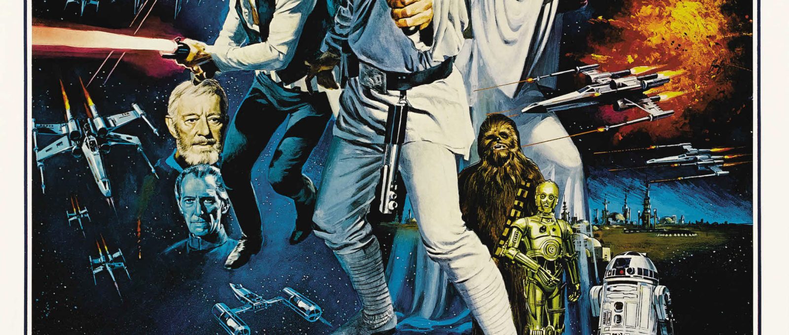
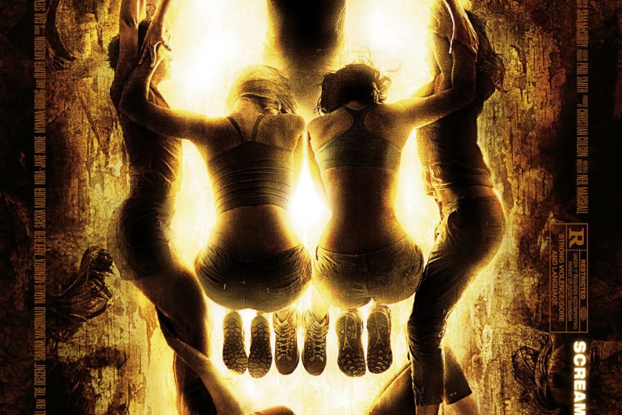
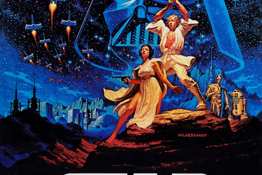
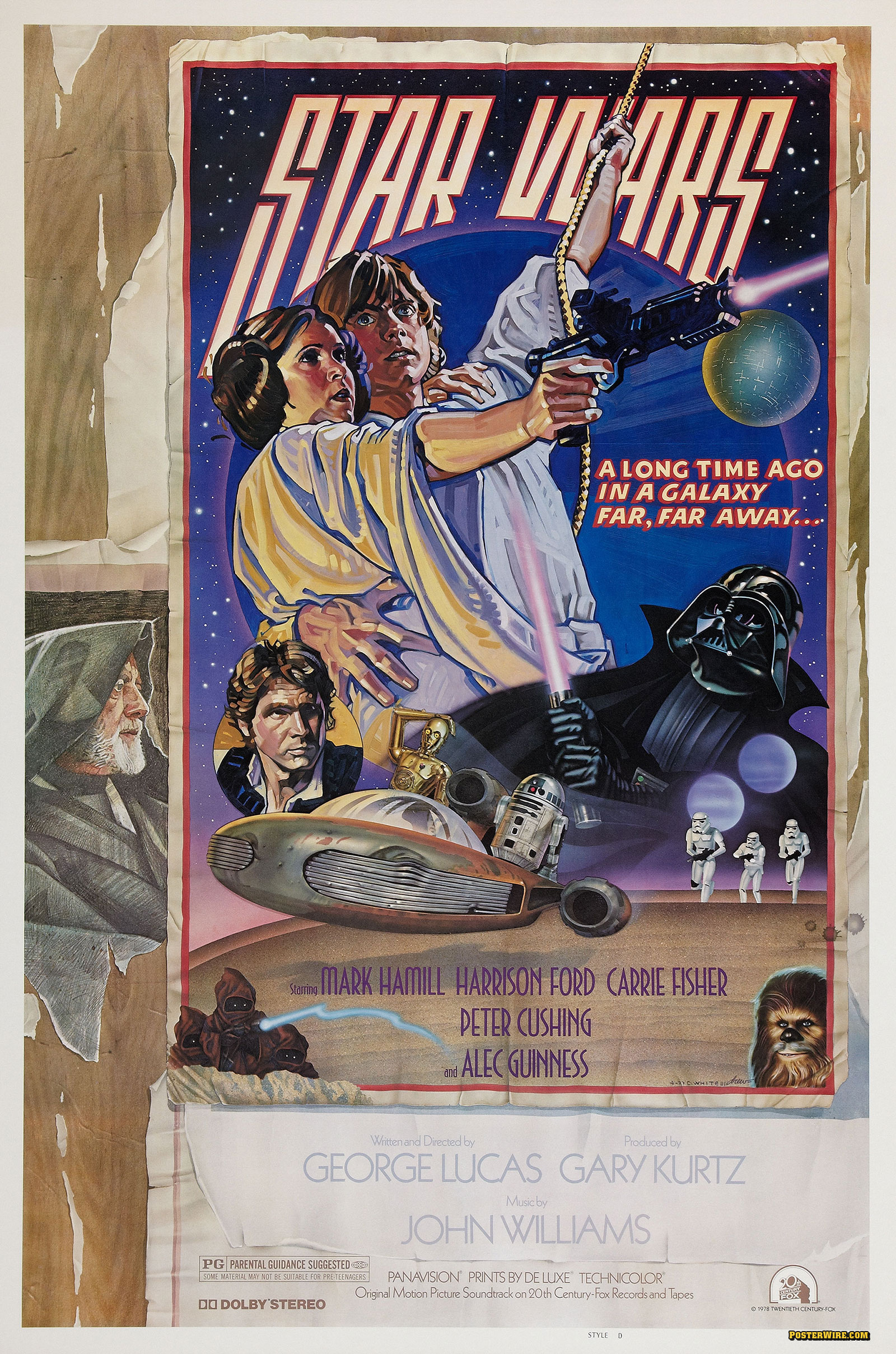
How utterly artless.
Funny, isn’t it, how the Luke Skywalker in the original Episode IV poster looks more “real” than the Mark Hamill in the updated DVD cover. Ditto the painted Han Solo in the original Empire Strikes Back poster.
But what’s up with Solo in the Return of the Jedi poster? He looks like he’s trying not to throw up on Leia’s head…
I think it’s time for a quote from George Lucas!
Drew Struzan: “Why do you use illustration to advertise and represent your projects? Computer manipulated photographs dominate the advertising of so many studios, but you continue to loyally choose illustration….â€
George Lucas: “The kind of movies I make are more fanciful in nature, more mythical in nature. To market my films, I like to move one step away from photo- realism to something that’s a little grander, a little more glorious, and something a bit more romantic than what you get with just simple photographs.â€
The new Empire poster is particularly repulsive.
The Vader pose on the ESB is actually from the marketing art from Revenge of the Sith. The photo art on the SW DVDs (including the previous releases and the prequels) annoys me intensely, especially considering the rich history of posters that the films have.
Isn’t the reason that movie posters aren’t typically used as DVD covers is that they aren’t neccessarily suitible for shelf display — from a “point-of-purchase” standpoint?
These new Star Wars DVD works were obviously made in Photoshop, and its purpose was possibly to have the ability to reposition the characters in order to make promotional materials. …Doesn’t stop it from looking tacky, though.
I’ve noticed a trend in movie poster design to be VERY simple lately, often comprised of one or two subjects in a symmetrical layout… and this I suspect is due to adapting the imagery not just for posters, but for DVD covers, web sites, billboards, banners, promotional materials, etc. It’s like the posters are no longer posters, in the traditional sense, but displays of the movie’s “icons”, as it were.
…my two cents.
In new DVD Cover Mark shows like a graphic computer…
Very strange.
George Lucas needs to call Lowry Digital again! and restore the original trilogy “unaltered” once and for all!like 2004 special edition dvd .and transfer the restore the original negatives into the Blue Ray Format coman George im sure you wont lose money thats what all fans really want!!!!
Aaargh! I positively HATE these cheap montages…
Why did George Lucas allow these crappy covers to go on teh re-releases? Don’t the marketing department realize no-one wants an “updated” or “Improved” cover. We want the artwork that we grew up loving and that, in this case, means the proper had drawn covers. Stop dishing out crap that no one wants.
Wow. I never thought about this before. I can go both ways. It is nice to see live images composited together. But it does kind of take away the creativity of painted posters. I would have liked it if they kept the original versions of the posters they used for ANH and ROTJ, but used the Style B Poster for ESB instead. The Special Edition posters were a nice compromise. They used live stills of the characters as reference but they were hand painted so at least they were still a fresh take on what had been done.