
Illustrator Robert McGinnis
A review of some notable traits of famous movie poster illustrators might go something like this: Bob Peak might be considered the master with his versatility. Drew Struzan the most popular via his accessible illustration style. John Alvin commanded layout and composition. Saul Bass was the pioneer with his graphic design.
One important factor is missing from this list: Sex.
(As Diddy might say, who is “bringing the sexy”? [cough])
The answer: Illustrator Robert McGinnis.
Since the 1950s, McGinnis has created over 1000 paperback book covers, in genres ranging from romance novels to detective mysteries. (Those interested in Robert McGinnis and his cover artwork should check out the phenomenal book: Paperback Covers of Robert McGinnis.) The closest to a true pin-up artist that key art illustration has seen, McGinnis became well-known for his ability to create alluring and striking images of women — so much so they received their own nickname — the “McGinnis Woman”.
Considering the mantra in Hollywood is “sex sells”, it was only natural to employ the premiere alluring paperback book cover artist for movie poster illustration. And what better film subject for this than the sexiest of super spys, James Bond?

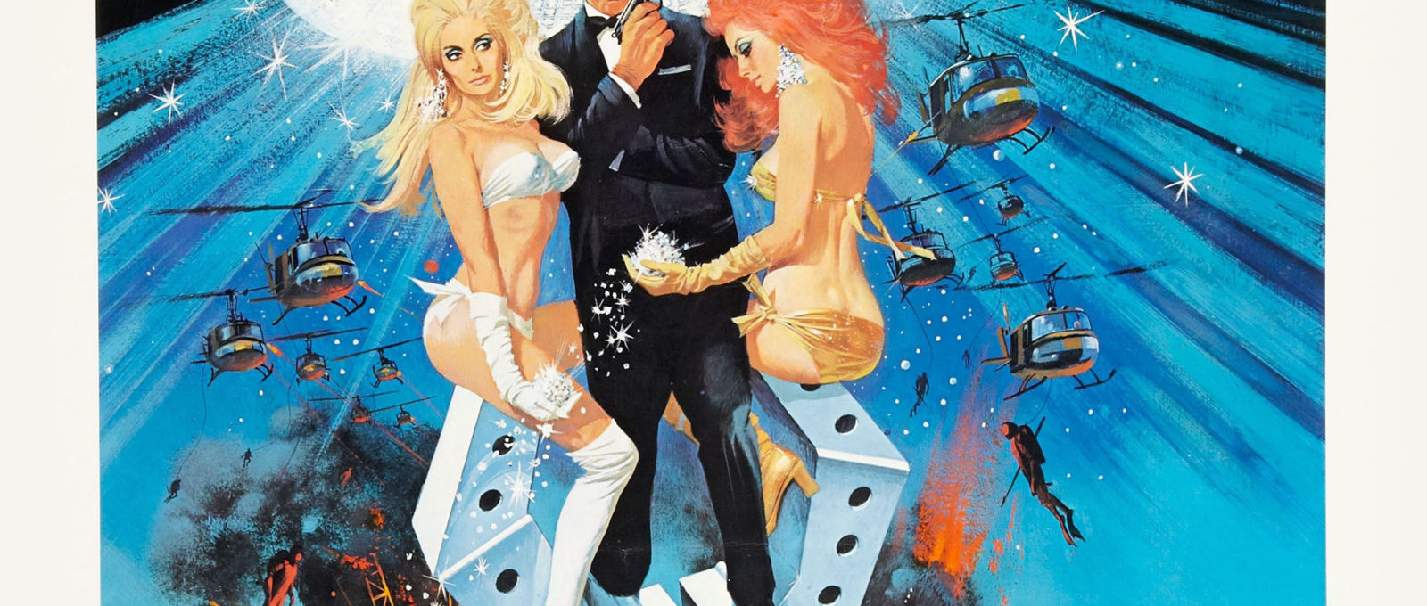
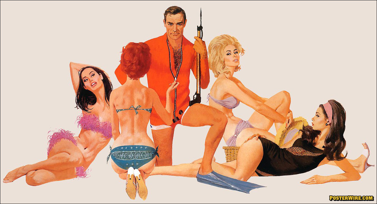
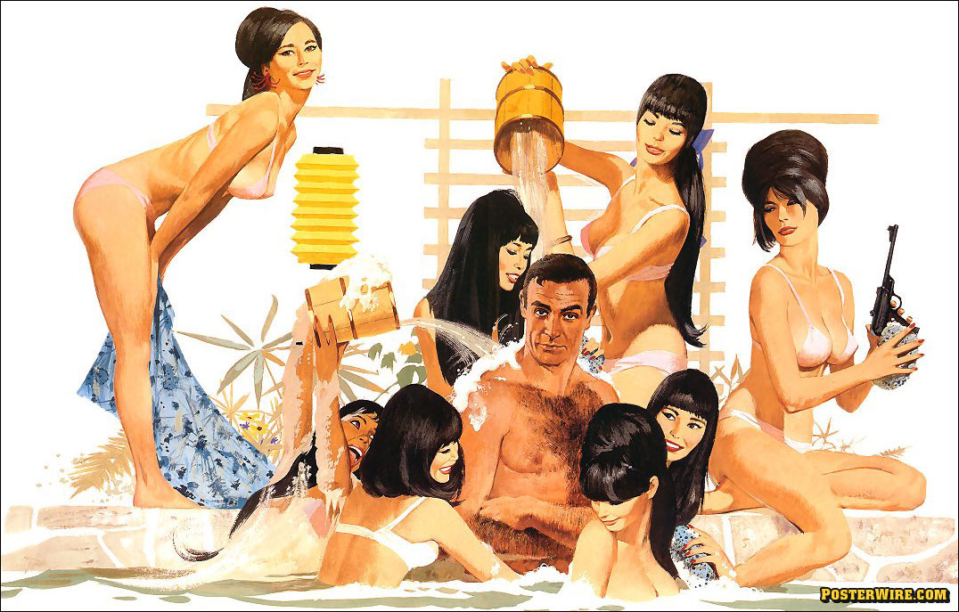
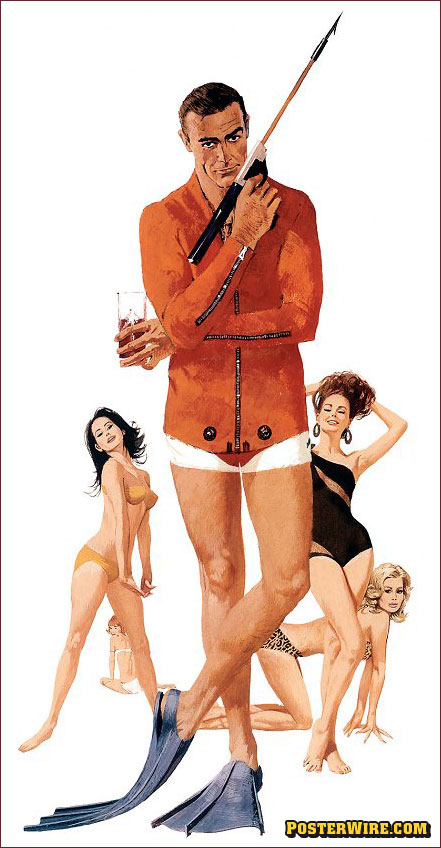
McGinnis illustrated several of the Bond film one-sheets during the 1960s through the 1970s. As we see in his Diamonds Are Forever movie poster, McGinnis helped create the signature “pyramid” composition (007 standing on top of a well built foundation of “Bond girls” and an exaggerated perspective view of the surrounding mayhem) found in many James Bond film one-sheets from that era. This McGinnis style (along with his work with illustrator Frank McCarthy) helped create the alluring visual mystique around the Bond character and became a template for other posters in the spy/adventure genre.
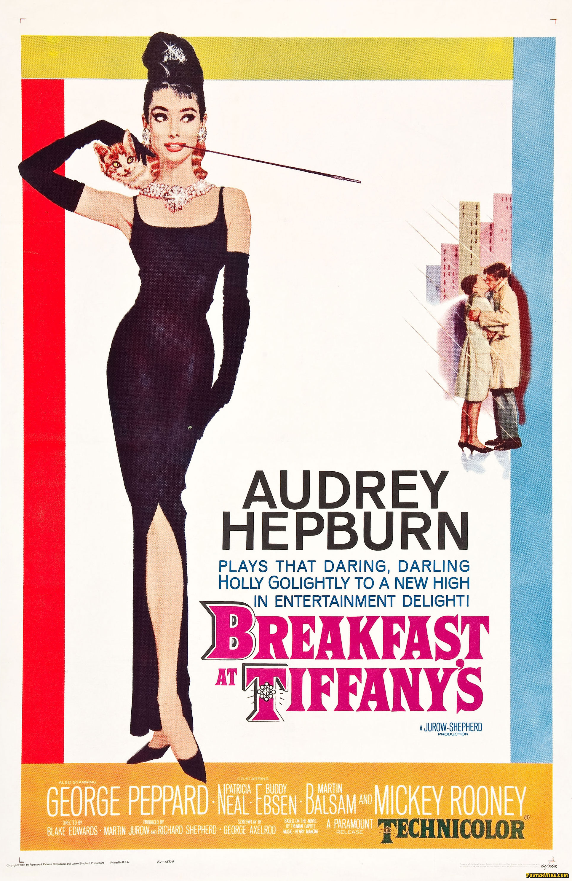
Robert McGinnis and his movie poster key art weren’t limited to just Bond girls. From Barbarella to Breakfast at Tiffanys, the allure of the “McGinnis Women” in illustration is obvious.


Of course these days Bond is more about the guns and explosions than he is about the sexy girls, so you’ve seen all these classic elements vanish from recent posters. Which is too bad, really.
I wish I still had this sidebar article from an ancient issue of some movie magazine in which six or seven one-sheet designs for License to Kill were considered and discarded by the producers. One could really see there how Bond had changed, not just from Moore to Dalton, but how the focus had shifted from sexy spy hijinks to more pedestrian action.
I own the Robert McGinnis Diamonds are Forever poster because I like the kinky camp of the movie so much. The artwork is appropriately garish for this bizarro Bond romp. One thing that bothers me about the illustration: Sean Connery’s ears are too high on his head.
My question about this terrific poster is what’s up with Bond’s lower legs? I hadn’t noticed the ears…untl Blofeld mentioned it!