Movie Poster Colors of Top Grossing Movies

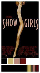
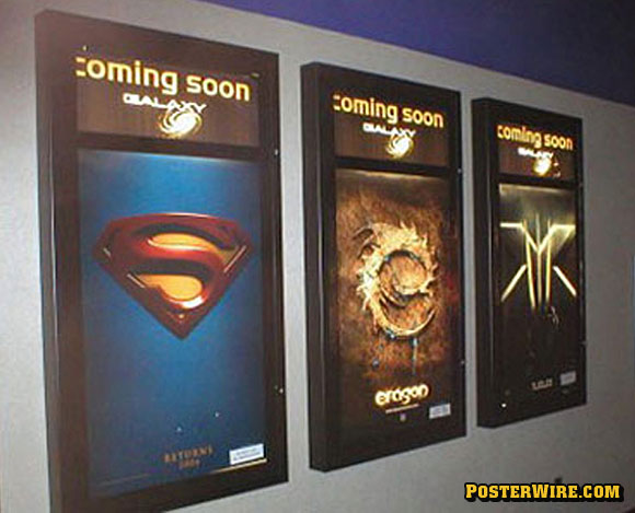
Speak Up’s experiment highlights a few basics in one-sheet color schemes: Comedies feature brighter colors (and rely heavily on white backgrounds), whereas other film genres skew darker (and more likely to use a black background). You could further categorize film types by color: Science fiction films tend to use cool tones (blues, greens). Action films use warm tones (reds, yellows). Horror films use earth tones (oranges, browns). Animated films use the most varied color combinations, reflecting the colors of the animation itself. Of course, there are countless exceptions to these genre by color examples.


I’ve been noticing lately that mediocre comedies go for the red text on white background. Wedding Crashers, I Now Pronounce You Chuck & Larry, License to Wed…
Actually, make that mediocre wedding based comedies