
With 20th Century Studios announcing the upcoming Avatar sequel, titled: Avatar: The Way of Water, it is important to take note of the new Avatar logo and typeface.
Notice anything different about the new Avatar logo? Where is the logotype using the Papyrus font? If you may not remember, then it is time to revisit the Saturday Night Live “Papyrus“ video short:
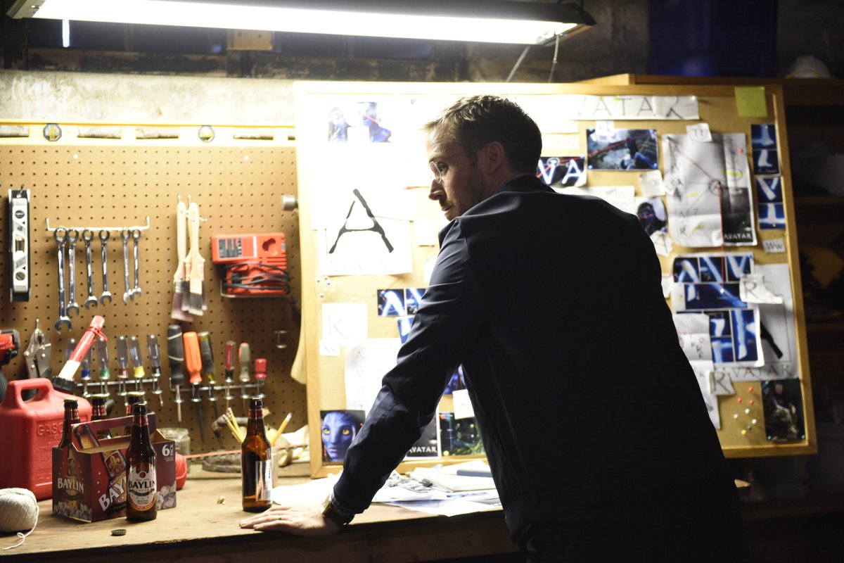
”Years after Avatar’s release, there’s one thing Steven (Ryan Gosling) just can’t get over.”
For the Season 43 premiere of Saturday Night Live (which aired September 30, 2017), host Ryan Gosling appears in the “Papyrus“ sketch about a character driven insane by the fact that ”Avatar, the giant international blockbuster, used the Papyrus font as its logo.”
The SNL “Papyrus“ video short was an immediate viral hit and struck a chord with many viewers, especially graphic designers and art directors.
The SNL digital short was written by SNL staff writer Julio Torres, who spoke about the idea of the skit starting as a throwaway joke from his stand-up act:
I was using it in my standup for a couple of weeks, and then when I was talking to Ryan Gosling about what I was thinking about writing for that week, he was like, “Well what about that Papayrus thing?” and I was like, “Well, I don’t think that can be anything beyond a sentence.” But then I just sort of thought about it and I was like, “Oh, I think it can be.”
Julio Torres, Saturday Night Live writer
Torres even tweeted about the Avatar logo using the Papyrus typeface months before the sketch appeared on SNL.

The Papyrus typeface was designed by Chris Costello, who was interviewed by CBS News following the Gosling SNL skit. “I designed the font when I was 23 years old,” Costello says. “I was right out of college… I had no idea that it was going to be on every computer in the world.” Costello sold the rights for the font for $750, which became a default typeface on Microsoft and Apple operating systems. “It was not my intent to have it be used for everything.” At the very least, Costello would like his fellow graphic designers to know he is sorry.
Apologies aside, it is interesting to note a lot of discussion has revolved around James Cameron’s film using (or based on?) the “tribal, yet futuristic“ font for his 3D opus. One deep dive into the hatred of Papyrus is made by designer and author David Kadavy, including a published analysis on the phenomenon: In Defense of Papyrus: Avatar Uses the World’s Second-Most-Hated Font to Signal the Downfall of Civilization
Kadavy breaks down the typeface from top to bottom, and even echoes SNL cast member Chris Redd’s line about the logo is modified from the Papyrus original: “Maybe that was the starting point, but they clearly modified this.“
After the success of the SNL “Papyrus“ video short, many outlets later took notice of a new and improved Avatar (and Papyrus-free) logo, and assumed it was a direct result of the Gosling sketch. A redesigned Avatar logoype was first released in 2016 at CinemaCon, but still featured Papyrus hanging on underneath the new mark. That updated logo became the basis of an all-new typeface called Toruk, courtesy of type designer John Roshell of Swell Type: Yep, I created the new AVATAR font.
In 2018, with the new Avatar logo and typeface in hand, the journey away from Papyrus was complete.
And if you thought the new Avatar: The Way of Water logo would settle the Avatar logo debate once and for all, you would be wrong.
Leave a Comment